The ActiveReports ChartControl offers 45 chart types which, along with many other properties, allow you to create virtually any type of chart that you can conceive. The fastest way to create a chart is to use the Chart Wizard.
 |
Note: If your Chart Wizard does not appear when you add a ChartControl to a report, see Access the Chart Wizard and Data Source for information. |
To create a chart using the Chart Wizard
- From the ActiveReports toolbox, drag the ChartControl onto a report.
- In the Chart Wizard that appears, the initial page displays the available 3D chart types, along with a preview of the selected chart to the right.

- Select the type of chart that you want to create. You can scroll to the right to view more charts, or select the 2D tab. You can also drop down the Chart Group field to limit the chart types displayed to Area, Bar, Financial, Line, Pie/Doughnut, or Point/Bubble. Some of the chart types are available only as 2D charts.
- Still on the Chart Type tab, you can further configure the chart by selecting the Swap Axes checkbox. If you are using a 3D chart, you can also change the projection and light settings. To do so, click the arrow to drop down the window for each item.
- When you have the chart type configured the way you want it, click the Next button to move on to the Appearance page.
Appearance page
- The Appearance page has two tabs: one allows you to select a color scheme, and the other allows you to select individual elements of the chart preview and select appearance settings for them.
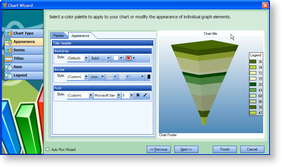
- Select a palette to set the color scheme, then click the Appearance tab.
- Click the different areas of the preview chart, such as the title, footer, legend, legend title, backdrop, and the chart itself. Each reveals a different set of properties that you can use to control the appearance of the element.
- When you finish with the appearance settings, click the Next button to move on to the Series page.
Series page
- The Series page has two tabs: one allows you to set the data source for the chart and bind data fields to X and Y values to each series in the chart, and the other allows you to view the data values for X and Y.
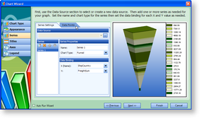
- Next to Data Source, click the ellipsis button to open the Chart Data Source dialog.
- On the OLE DB tab, next to Connection String, click the Build button.
- In the Data Link Properties window that appears, select Microsoft Jet 4.0 OLE DB Provider and click the Next button.
- Click the ellipsis (...) button to browse to your database or the sample Northwind database. Click Open once you have selected the appropriate access path.
- Click OK to close the window and fill in the Connection String field.
- In the Query field, enter a SQL query to select the data that you want.

Tip: A commonly used SQL Query for charts on the Nwind.mdb sample database is: SQL Query. Paste in the Query textbox. Copy CodeSELECT ShipCountry, SUM(Freight) AS FreightSum FROM Orders GROUP BY ShipCountry - Click OK to save the data source and return to the Chart Wizard.
- Select Series1 in the list of series, and set its name and chart type in the fields to the right.
- Drop down the fields in the Data Binding section to select X and Y values. The X value takes a string field, while the Y value takes a numeric field.
- If you do not need more than one series, delete Series2 and Series3.
- Click the Data Points tab to view the bound data or change the values.
- When you finish setting up the data series for the chart, click the Next button to go to the Titles page.
Titles page
- There is only one tab on the Titles page. Select the header or footer in the list, and change its properties in the fields below.
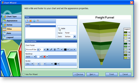
- If you do not want to include a title, either delete it or clear the Visible checkbox.
- Otherwise, set the title text and increase the font size, and click the Next button to go to the Axes page.
Axes page
- The Axes page has two tabs: one for Axis X and one for Axis Y.
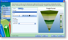
- On the Axis X tab, enter a title for the axis, and set the font size and other font properties.
- Select the check boxes next to any of the properties that you want to apply to the X axis.
- Enter or select a label format.

Tip: The ActiveReports chart control uses standard Visual Studio .NET formatting syntax. The format is {Tag : Format}. For example, {Value:C} formats the text as currency. {Value:D} formats the text as a date. - When you have set up Axis X, click the Axis Y tab to set its properties.
- When you have finished, click the Next button to go to the Legend page.
Legend page
- There is only one tab on the Legend page. Use it to set up the appearance of the legend.
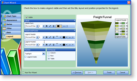
- If you do not want to display a legend for the chart, clear the Visible check box.
- Otherwise, set font properties for the labels in the Labels section.
- Enter text to display in the legend header and footer, and set font properties on the text in the Header and Footer section.
- In the Position section, select the position relative to the chart in which to display the legend. You can also select the Legend inside check box to place the legend inside the chart.
- In the Grid Layout section, select the layout for the legend items.
- When you have finished, click the Finish button to save the changes and close the Chart Wizard.
See Also