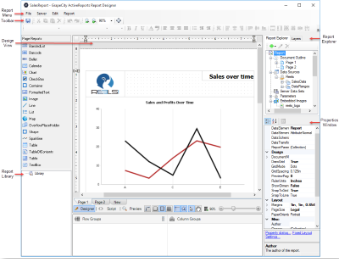
The ClickOnce End User Designer is a report designing application that is deployed in the ActiveReports Server. You can create a new ActiveReports Page, RDL, or Section report from the Report Portal or modify the ones that are already hosted on the ActiveReports Server.
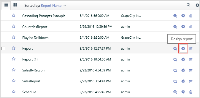
You can access the ClickOnce End User Designer for:
- Creating a new report from the Report portal.
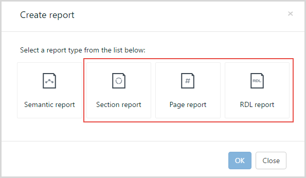
- Modifying an existing report from the Admin Portal or the Report Portal.
The ClickOnce End User Designer consists of the following elements.
| Element | Name | Description | |
|---|---|---|---|
| Design View allows to create, design and edit a report. | |||
Design View |
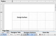
Design Surface | The design surface of a report appears initially as a blank page and grid lines. You can create your own layout and drag report controls and fields onto the design surface to display your data. | |

Ruler |
Rulers | Use the ruler to determine how your report will look on paper. | |
Designer Tabs |
Designer Tabs
|
There are three tabs located at the bottom of the report design surface. Create a report layout in the Designer tab, write a script in the Script tab to implement .NET functionality and see the result in the Preview tab.
|
|

Page Tabs |
Page Tabs | Report layouts are designed on separate pages and you can control the way each page appears. Using page tabs, you can select which page to view or edit, add new pages, remove existing pages, reorder pages, and create duplicate pages. | |
 |
Designer Buttons |
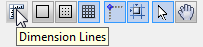
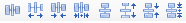
The Designer buttons are located to the right of the designer tabs along the bottom of the designer.
Dimension Lines. Dimension lines let you track the location of the control as you move it by displaying the distance between the control and the edge of the writable area of the report. Hide Grid. By default, grid lines and dots appear on the report design surface. You can click this button to hide the grid and design your report on a blank page. Show Dots. You can click this button to have dots appear on the design surface in between the grid lines to guide you in the placement of controls. Show Lines. You can click this button to have faint grey lines appear on the design surface in between the grid lines to guide you in the placement of controls. Snap Lines. This setting aligns the control you are dragging with other controls on the report design surface. When you drag the control around, snap lines appear when it is aligned with other controls or with the edges of the report, and when you drop it, it snaps into place in perfect alignment. Snap to Grid. This setting aligns the control you are dragging with grid lines on the report design surface. When you drop the control, it snaps into place in alignment with the nearest grid mark. To place your controls freely on the report design surface, turn this setting off. Select Mode. In Select mode, when you click items on the report designer surface, you select them. Use this mode for editing, data binding and styling in the Designer tab. An arrow cursor appears in the Select mode. Pan Mode. Use the Pan mode to make navigation easier. In this mode, you cannot select, edit, or delete a control from the design surface. A hand cursor appears in Pan mode and you can navigate through your report by pressing the left mouse button and dragging the report to the desired position. |
|
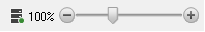 |
Zoom Bar | The Zoom bar below the report design surface where the slider thumb is set to 100% by default. The slider allows you to zoom in and out of the report designer surface. Using this slider you can magnify the layout from 50% to 400%. | |
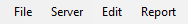
| Report Menu provides access to common reporting operations. | |||
 |
File > Save | Opens the Save dialog. | |
| File > Save As | Opens the Save As dialog to save the newly created report. | ||
| File > Export |
Opens the Export dialog. | ||
| Server > Edit Shared Data Sources | Opens the Server Shared Data Sources dialog where you can add, edit or remove shared data sources of the report. | ||
| Server > Edit Shared Data Sets | Opens the Server Shared Data Sets dialog where you can add, edit or remove shared data sets of the report. | ||
| Report > Report Parameters | Opens the Report dialog to the Parameters page where you can manage, add and delete parameters. | ||
| Report > Embedded Images | Opens the Report dialog to the Images page, where you can select images to embed in a report. Once you add images to the collection, they appear in the Report Explorer under the Embedded Images node. | ||
| Report > Convert to Master Report (RDL Reports only) | Converts an RDL report to a Master Report. It disappears from the Report menu when a master report is applied to the report through Set Master Report. |
||
| Report > Report Properties | Opens the Report dialog to the General page where you can set report properties such as the author, description, page header and footer properties, and grid spacing. | ||
| Report > Stylesheet Editor | Opens the New Style - Stylesheet Editor dialog where you can manage styles of the report. | ||
| Report > Set Master Report (RDL Reports only) | Opens the Open dialog to select a Master Report (RDLX-master file format) to apply to the current project. | ||
|
Report > View
|
Opens the Designer, Script, or Preview tab. | ||
| Report > Page Header (RDL Reports only) | Toggles the report Page Header on or off. | ||
| Report > Page Footer (RDL Reports only) | Toggles the report Page Footer on or off. | ||
| Toolbar comprises of buttons and dropdown lists which offer functions for a number of commonly used commands. | |||
 |
Text Decoration | This group of the buttons includes: Style Names, Font Names, Font Sizes, Bold, Italic, Underline, ForeColor, BackColor. | |
 |
Text Alignment | This group of the buttons includes: Align Left, Align Center, Align Right, Align Justify. | |
 |
Layout Editing | This group of the buttons includes: Zoom Out, Zoom In, Zoom. | |
 |
Control Alignment | This group of the buttons includes: Align to Grid, Align Lefts, Align Rights, Align Tops, Align Middles, Align Bottoms. | |
 |
Control Resizing | This group of the buttons includes: Make same width, Make same height, Make same size, Size to Grid. | |
 |
Control Spacing | This group of the buttons includes: Make horizontal spacing equal, Increase horizontal spacing, Decrease horizontal spacing, Remove horizontal spacing, Make vertical spacing equal, Increase vertical spacing, Decrease vertical spacing, Remove vertical spacing. | |
 |
Z-order Alignment | This group of the buttons includes: Bring to Front, Send to Back. | |
 |
RichTextBox Commands | This group of the buttons includes: Bullets, Indent, Outdent. | |
| Report Explorer gives you a visual overview of the report elements in the form of a tree view where each node represents a report element. | |||
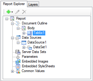 |
Report Explorer |
|
|
| Toolbox displays the list of controls available for the report. | |||
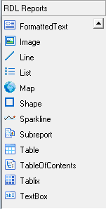 |
RDL Reports |
The RDL Reports Toolbox comprises of the following items:
|
|
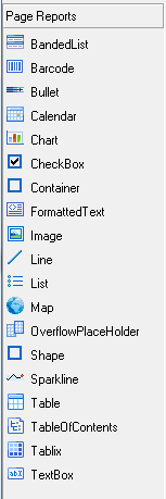 |
Page Reports |
The Page Reports Toolbox comprises of the following items:
|
|
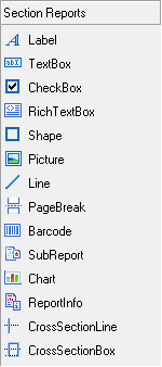 |
Section Reports |
The Section Reports Toolbox comprises of the following items:
|
|
| Properties Window gives access to the properties of any page, section, data region, control or the report itself. | |||
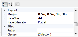 |
Properties Window | Select a property to reveal a description at the bottom of the window. By default, this window is placed to the right of the report design area. | |
| Layers List window displays a list of layers in the report. Layers is a named group of controls. Layers are supported in Page Report and Rdl Report types only. | |||
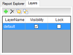 |
Layers List Window |
You can lock or unlock, add or remove, show or hide these groups of controls. When you create a new report, a Default Layer is automatically added to it.
This feature is useful where you use the scanned copy of the form to trace that you can place on one Layer and you want use it to print. |
|
| Report Library window gives access to the report parts that you can reuse in other reports. | |||
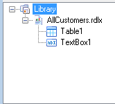 |
Library Window |
Report parts are groups of controls (with data and settings) in a report that you can reuse in other reports.
You can also use report parts from a report that is hosted on an instance of ActiveReports Server. For example, you can use Chart and Tablix data regions from Report1, and a Table data region from Report2 to create a new report. |
|