You can create a page report with a chart using the ActiveReports Chart data region. This walkthrough illustrates how to create a report with a chart.
The walkthrough is split into the following activities:
- Creating an ActiveReports project in Visual Studio
- Connecting the report to a data source
- Adding a dataset
- Adding a chart data region with data and grouping to the report
- Configuring the appearance of the chart
- Viewing the report
Note:
- This walkthrough uses the Sales table from the Reels database. By default, in ActiveReports, the Reels.mdb file is located in the [User Documents folder]\GrapeCity Samples\ActiveReports 12\Data folder.
- Although this walkthrough uses Page reports, you can also implement this using RDL reports.
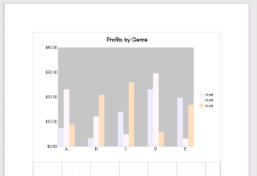
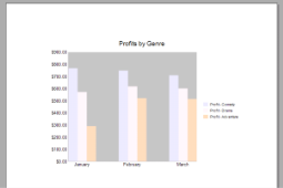
When you complete this walkthrough you get a layout that looks similar to the following at design time and at run time.
Design-Time Layout
Run-Time Layout
To create an ActiveReports project in Visual Studio
- Create a new Visual Studio project.
- In the New Project dialog that appears, select ActiveReports 12 Page Report Application and in the Name field, rename the file as ProfitsByGenre.
- Click OK to create a new ActiveReports 12 Page Report Application. By default a Page report is added to the project.
See Adding an ActiveReport to a Project for information on adding different report layouts.
To connect the report to a data source
- In the Report Explorer, right-click the Data Sources node and select the Add Data Source option or select Data Source from the Add button.
- In the Report Data Source Dialog that appears, select the General page and in the Name field, enter a name like ReportData.
- On this page, create a connection to the Reels database. See Connect to a Data Source for information on connecting to a data source.
To add a dataset
- In the Report Explorer, right-click the ReportData data source node and select the Add Data Set option or select Data Set from the Add button.
- In the DataSet Dialog that appears, select the General page and enter the name of the dataset as ProfitsByGenre. This name appears as a child node to the data source icon in the Report Explorer.
- On the Query page of this dialog, in the Query field enter the following SQL query.
SQL Query Copy CodeSELECT Profit, SalesID, SaleDate, GenreName FROM SalesByGenre WHERE (SalesID < 1090) AND (GenreName = "Comedy" OR GenreName = "Drama" OR GenreName = "Adventure") ORDER BY SalesID
- Click the Validate DataSet
 icon at the top right hand corner above the Query box to validate the query.
 - On the Fields page, add a new field by clicking the Add (+) button above the fields list.
- Set the Name to Month and the Value of the new field to =Fields!SaleDate.Value.Month
This parses out the month from the date field. - Click OK to close the dialog. Your data set and queried fields appear as nodes in the Report Explorer.
To add chart data region with data and grouping to the report
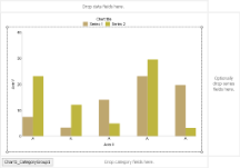
- From the toolbox, drag the Chart data region onto the design surface of the report .
- In the wizard Select a Chart Type that appears, select the chart type Column and go to the Properties Window to set the following properties:
Property Name Property Value Location 0in, 0in Size 6.5in, 4.5in - Double-click inside the chart area to display the UI along the top, right, and bottom of the chart to drop fields in.
- From the Report Explorer, drag the Month field into the area below the chart labeled "Drop category fields here." This automatically binds the Month field to the X axis.
- Right-click the month category group and select Edit to open the Chart Data - Category Groups dialog.
- In the dialog that appears on the General page, go to the Label field and enter the following expression:
=MonthName(Fields!Month.Value)and click OK to close the dialog. - From the ReportExplorer, drag the Profit field into the area above the chart labeled "Drop data fields here." This plots the profits to the Y axis of the chart.
- In the Report Explorer, drag the GenreName field into the area to the right of the chart labeled "Drop series fields here." This sets the series to be charted in the chart area.
- Right-click the genre series group and select Edit to open the Chart Data - Series Groups dialog.
- In the dialog that appears on the General page, go to the Label field and enter the following expression:
=Fields!GenreName.Value. This shows genre names in the legend. - Click OK to close the dialog.
- Select the chart and at the bottom of the Properties Window, select the Chart Data command. See Properties Window for further details on accessing commands.
- In the Chart Data dialog that appears, under Series Values go to the Value field and make sure it is set to
=Sum(Fields!Profit.Value).
To configure the appearance of the chart
- Select the chart and at the bottom of the Properties Window, select the Chart appearance command.
- In the Chart Appearance dialog that appears set the following:
Title Page
On the Title page enter Profits by Genre in the Chart title text box and change the Size property to 14pt.Palette Page
On the Palette page and select Light in the drop down list. This is a good color choice because it differentiates between genres without highlighting one of them unintentionally.Plot Area Page
On the Plot Area page set the Background Fill Color > Fill Color to Silver. - Click OK to close the dialog.
- Select the Chart Legends and at the bottom of the Properties Window, select the Property dialog command.
- In the Chart Legend - General dialog that appears, uncheck the Use smart settings option.
- Click OK to close the dialog.
- Select the X-Axis label in the chart and at the bottom of the Properties Window, select the Property dialog command.
- In the Chart X-Axis - Title dialog that appears set the following properties:
Title Page
On the Title page, in the X-Axis Title field remove the default "Axis X" text.Labels Page
On the Labels page, set the Size property to 10pt. - Click OK to close the dialog.
- Select the chart and at the bottom of the Properties Window, select the Chart Y-axis command.
- In the Chart Y-Axis - Title dialog that appears set the following properties:
Title Page
On the Title page, in the Y-Axis Title field remove the default "Axis Y" text if available.Labels Page
On the Labels page and in the Format code field, select Currency in the Format drop-down list. Set the Size property to 10pt.Scale Page
On the Scale page and in the Minimum field enter 0 (zero). This sets the currency labels to start at zero on the Y axis. - Click OK to close the dialog.
To view the report
- Click the Preview tab to view the report at design time.
OR
- Open the report in the Viewer. See Windows Forms Viewer for further information.
See Also