The Bullet report control is an easy-to-read linear gauge that is a good alternative to using a dashboard for data visualization.
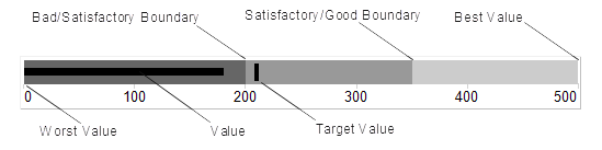
A bullet graph has a pointer that shows a key measure. With this control, you can take a single value, the year-to-date revenue for example, and compare it to a target value that you define in the control's properties. You can also define the beginning of the graph as the worst value and the end of the graph as the best value. To make the data visualization even more intuitive, you can define a qualitative range (bad, satisfactory and good) for segments on the bullet graph and immediately see the position of the key measure within the bullet graph range.
You can combine multiple Bullets into a data region, a table for example, to show single values side by side. You can orient Bullets horizontally or vertically, and put them together as a stack to analyze several data dimensions at once.

Bullet Dialog
Properties for the Bullet are available in the Bullet dialog. To open it, with the Bullet control selected on the report, under the Properties Window, click the Property dialog link.
The Bullet dialog lets you set properties on the report control with the following pages.
Note: You can click <Expression...> in many of these properties to open the Expression Editor where you can create an expression to determine the value. For properties with enumerated values, the values are listed under Constants in the Fields tree view on the left side of the Expression Editor.
General
Name: Enter a name for the Bullet that is unique within the report. You can only use underscore (_) as a special character in the Name field. Other special characters such as period (.), space ( ), forward slash (/), back slash (\), exclamation (!), and hyphen (-) are not supported.
Data
Value: Enter an expression to use as the bullet value.
Target Value: Enter an expression to use as the target value of the bullet graph.
Appearance
Bullet Graph Orientation
Horizontal: Select to display a horizontal bullet graph.
Vertical: Select to display a vertical bullet graph.
Value Style
Color: Select a color to use for the value marker, or select the <Expression...> option to open the Expression Editor and create an expression that evaluates to a .NET color. The default value is Black.
Target Style
Target Type: Choose Line, Dot or Square. The default value is Line.
Color: Select a color to use for the target value marker, or select the <Expression...> option to open the Expression Editor and create an expression that evaluates to a .NET color. The default value is Black.
Width: Enter a value in points to set the width of the target value marker. The default value is 3pt.
Note: The Width setting applies only when the Target Type is set to Line.
Tick Marks
Position: Choose None, Inside or Outside. The default value is Outside.
Color: Select a color to use for the tick marks, or select the <Expression...> option to open the Expression Editor and create an expression that evaluates to a .NET color. The default value is LightGray.
Width: Enter a value in points to set the width of the tick marks. The default value is 1pt.
Interval between tick marks: Set the interval at which you want to show tick marks.
Ranges
Worst Value: Enter a value or expression to define the lowest value on the graph.
Bad/Satisfactory Boundary: Enter a value or expression to define the boundary between bad and satisfactory values.
Display 3 Sections: Select this check box to show three separate value ranges (bad, satisfactory, and good) instead of two (bad and satisfactory). This enables the Satisfactory/Good Boundary.
Satisfactory/Good Boundary: Enter a value or expression to define the boundary between satisfactory and good values.
Best Value: Enter a value or expression to define the highest value on the graph.
Labels
Display Labels: Select this check box to display axis labels for the bullet graph. Selecting this box enables the rest of the properties on this page.
Format: Select one of the provided format codes or use a custom .NET formatting code to format dates or numbers. For more information, see MSDN's Formatting Types topic.
Font
Family: Choose the font family name. The default value is Arial.
Size: Choose the size in points for the font. The default value is 10pt.
Style: Choose Regular, Bold, Italic, Underline or Strikeout. The default value is Regular.
Color: Select a Web or custom color for the font. The default value is Black.
Navigation
Document map label: Enter an expression to use as a label to represent this item in the table of contents (document map).
Bookmark ID: Enter an expression to use as a locator for this Bullet. You will then be able to provide a bookmark link to this item from another report control using a Jump to bookmark action.
Visibility
Initial visibility
-
Visible: The bullet graph is visible when the report runs.
-
Hidden: The bullet graph is hidden when the report runs.
-
Expression: Use an expression with a Boolean result to decide whether the bullet graph is visible. True for hidden, False for visible.
Visibility can be toggled by another report control: Select this check box to display a toggle image next to another report control. This enables the drop-down box below where you can specify the TextBox control that toggles the visibility of the bullet. The user can click the toggle item to show or hide this bullet.
Data Output
Element Name: Enter a name to be used in the XML output for this Bullet.
Output: Choose Auto, Yes, No, or Content only to decide whether to include this Bullet in the XML output. Auto exports the contents of the bullet graph only when the value is not a constant.
See Also