Xuni FlexPie provides the option to display legend for denoting the type of the data presented in the pie slices. The position of legend is by default set to "Auto", which means the legend positions itself automatically depending on the real estate available on the device. This allows the pie to efficiently occupy the available space on the device.
Users have the option to customize the appearance of the legend to enhance the visual appeal of the FlexPie control. To customize the legend, you can set the following properties at design time.
| Property | Description |
| Position |
This property provides the following values
|
| BorderColor | Sets the color of the border. |
| BorderWidth | Sets the width of the border. |
| BackgroundColor | Sets the color of the background. |
| LabelTextColor | Sets the color of the text appearing in the label. |
 |
The legend automatically wraps when the Position property is set to Top, Bottom, Left or Right, Orientation is set to Horizontal and there is not enough screen real estate. |
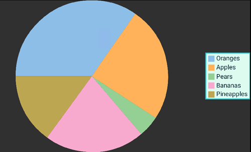
The image below shows how the FlexPie appears after these properties have been set.
The following code examples demonstrate how to set these properties in C# and in XAML. These examples use the sample created in the Quick Start section.
In Code
| C# |
Copy Code |
|---|---|
//setting the Legend chart.Legend.Position = Xuni.Forms.ChartCore.ChartPositionType.Right; chart.Legend.BackgroundColor = Color.FromHex("#DDF9EC"); chart.Legend.BorderColor = Color.FromHex("#00C7CC"); chart.Legend.BorderWidth = 2; chart.Legend.LabelTextColor = Color.FromHex("#022A31"); | |
In XAML
Include the ChartCore assembly by modifying the <ContentPage> tag as shown below:
| XAML |
Copy Code |
|---|---|
<ContentPage xmlns="http://xamarin.com/schemas/2014/forms" xmlns:x="http://schemas.microsoft.com/winfx/2009/xaml" x:Class="Appl.QuickStart" xmlns:xuni="clr-namespace:Xuni.Forms.FlexPie;assembly=Xuni.Forms.FlexPie" xmlns:chartcore="clr-namespace:Xuni.Forms.ChartCore;assembly=Xuni.Forms.ChartCore"> | |
Add the markup to customize the chart legends inside the markup for the FlexPie control as shown below:
| XAML |
Copy Code |
|---|---|
<xuni:FlexPie x:Name="chart" ItemsSource="{Binding Data}" BindingName="Name" Binding ="Value" Grid.Row="1" Grid.ColumnSpan="2"> <xuni:FlexPie.Legend > <chartcore:ChartLegend BorderColor="#00C7CC" BorderWidth="2" BackgroundColor="#DDF9EC" LabelTextColor = "#022A31" Position="Bottom"> </chartcore:ChartLegend> </xuni:FlexPie.Legend> </xuni:FlexPie> | |