Although, Xuni controls match the native controls on all three platforms by default and are designed to work with both: light and dark themes available on all platforms. But, there are several properties to customize the appearance of the FlexChart control. You can change the background color of the chart plot area, set the color of the series, add colored borders of specified thickness to charts as well as series and do much more to enhance the appearance of the control.
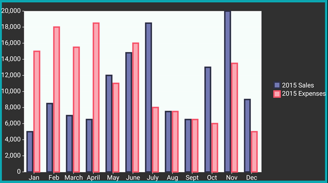
The image below shows a customized FlexChart control.
The following code examples demonstrate how to customize the FlexChart and its series. These examples use the sample created in the Quick Start section, with multiple series added to the chart. See Mixed Charts to know how to add multiple series to a FlexChart.
In Code
| C# |
Copy Code |
|---|---|
chart.PlotAreaBackgroundColor = Color.FromHex("#F6FDFA"); chart.BorderColor = Color.FromHex("#0CA8B2"); chart.BorderWidth = 10; _series.Color = Color.FromHex("#7278B2"); _series.BorderColor = Color.FromHex("#2D3047"); _series.BorderWidth = 3; _series2.Color = Color.FromHex("#FAA9B4"); _series2.BorderColor = Color.FromHex("#F6546A"); _series2.BorderWidth = 3; | |
In XAML
| XAML |
Copy Code |
|---|---|
<xuni:FlexChart x:Name="chart" ChartType="Column" ItemsSource="{Binding Data}" BindingX="Name" PlotAreaBackgroundColor="#F6FDFA" BorderColor="#0CA8B2" BorderWidth = "10" > <xuni:FlexChart.Series> <xuni:ChartSeries x:Name="Sales2015" Name="2015 Sales" Binding="Sales" Color="#7278B2" BorderColor="#2D3047" BorderWidth="3"> </xuni:ChartSeries> <xuni:ChartSeries x:Name="Expenses2015" Name="2015 Expenses" Binding="Expenses" Color="#FAA9B4" BorderColor="#F6546A" BorderWidth="3"> </xuni:ChartSeries> </xuni:FlexChart.Series> </xuni:FlexChart> | |