Xuni ICollectionView interface supports grouping for data controls, such as ListBox and FlexGrid. To enable grouping, add one or more GroupDescription objects to the XuniGroupedCollectionView property. GroupDescription objects are flexible, allowing you to group data based on value or on grouping functions.
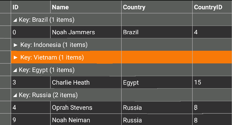
The image below shows how the FlexGrid appears, after Grouping is applied to column Country.
The following code example demonstrates how to apply Grouping in FlexGrid in C# and XAML. The example uses the data source, Customer.cs created in the FlexGrid's Quick Start section.
- Add a new Forms XAML Page,
Grouping.xamlto your project. - To initialize a FlexGrid control and enabling grouping in XAML, modify the markup between the
<ContentPage></ContentPage>tags and inside the<StackLayout></StackLayout>tags, as shown below.In XAML
XAML Copy Code<ContentPage xmlns="http://xamarin.com/schemas/2014/forms" xmlns:x="http://schemas.microsoft.com/winfx/2009/xaml" x:Class="App1.Grouping" xmlns:xuni="clr-namespace:Xuni.Forms.FlexGrid;assembly=Xuni.Forms.FlexGrid" > <ContentPage.ToolbarItems> <ToolbarItem x:Name="tb_Collapse" Text="Collapse"></ToolbarItem> </ContentPage.ToolbarItems> <StackLayout> <Grid VerticalOptions="FillAndExpand"> <xuni:FlexGrid x:Name="grid" AutoGenerateColumns="True" IsGroupingEnabled="True" /> </Grid> </StackLayout> </ContentPage>
- In the Solution Explorer, expand the
Grouping.xamlnode and openGrouping.xaml.csto open the C# code behind. - Add the following code in the Grouping class constructor to apply grouping to the column Country in the FlexGrid:
In Code
C# Copy CodeXuniGroupedCollectionView<string, Customer> colView; Func<Customer, string> selector; public Grouping() { InitializeComponent(); this.tb_Collapse.Command = new Command((s) => { this.grid.CollapseGroups(); }); this.grid.GroupDisplayBinding = new Binding("Key"); UpdateColView(); } private async void UpdateColView() { selector = x => x.Country; colView = new XuniGroupedCollectionView<string,Customer>(selector); await colView.SetSourceAsync(App3.Customer.GetCustomerList(10)); this.grid.ItemsSource = colView; }