FlexGrid has various built-in properties to customize grid's appearance. A user can use these properties to set FlexGrid's background color, alternating row color, text color, header color, font, selection mode, selected cell color, etc.
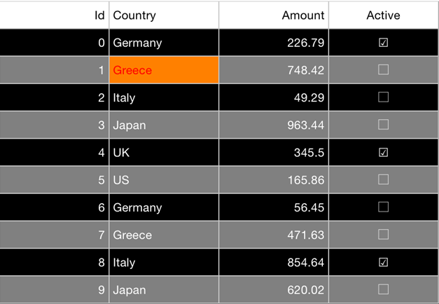
The image below shows customized appearance in FlexGrid after these properties have been set.
The following code example demonstrates how to set these properties to customize grid's appearance. The example uses the sample created in the Quick Start section.
In Code
grid.selectionMode = GridSelectionMode.Cell
grid.backgroundColor = UIColor.blackColor()
grid.alternatingRowBackgroundColor = UIColor.grayColor()
grid.textColor = UIColor.whiteColor()
grid.borderColor = UIColor.redColor()
grid.columnHeaderBackgroundColor = UIColor.whiteColor()
grid.columnHeaderTextColor = UIColor.blackColor()
grid.selectionMode = gridSelectionModeCell;
grid.backgroundColor = [UIColor blackColor];
grid.alternatingRowBackgroundColor = [UIColor grayColor];
grid.textColor = [UIColor whiteColor];
grid.borderColor = [UIColor redColor];
grid.columnHeaderBackgroundColor = [UIColor whiteColor];
grid.columnHeaderTextColor = [UIColor blackColor];
grid.SelectionMode = FlexSelectionMode.FlexSelectionModeCell;
grid.BackgroundColor = UIColor.Black;
grid.AlternatingRowBackgroundColor = UIColor.Gray;
grid.TextColor = UIColor.White;
grid.BorderColor = UIColor.Red;
grid.ColumnHeaderBackgroundColor = UIColor.White;
grid.ColumnHeaderTextColor = UIColor.Black;