Wijmo UI for the Web
Customizing UI Elements
With Wijmo, you can easily customize the appearance of widget elements according to your requirement. For instance, if you want to customize a header row in wijgrid, you can use basic HTML styling attributes to redefine the default CSS class, wijmo-wijgrid-headerrow in following manner:
| Example Title |
Copy Code |
|---|---|
<style type="text/css"> /* Column header */ wijmo-wijgrid .wijmo-wijgrid-headerrow>th{ color: blue !important; background: lightblue !important; height: 50px; font: bold 14pt sans-serif !important; text-align: left; } </style> | |
This wijgrid column now appears like the image on the right hand side: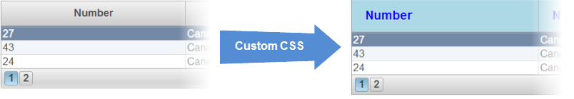
Similarly, you can easily customize back-color, text-alignment or borders of header cells and grid cells by customizing the default CSS classes defined for different elements.
The following table illustrates the main CSS classes used in UI elements of the wijgrid widget.
| UI Element | CSS class |
|---|---|
| Common | |
| Row | wijmo-wijgrid-row |
| Datarow | wijmo-wijgrid-datarow |
| Header row | wijmo-wijgrid-headerrow |
| Header row | wijmo-wijgrid-headerrow |
| Footer row | wijmo-wijgrid-footerrow |
| Highlighted row | wijmo-wijgrid-row.ui-state-hover |
| Alternating row | wijmo-wijgrid-alternatingrow |
| Row header | wijmo-wijgrid-rowheader |
| Filtering | |
| Filter row | wijmo-wijgrid-filterrow |
| Filter cell | wijmo-wijgrid-filter |
| Filter input | wijmo-wijgrid-filter-input |
| Sorting | |
| Sort icon | wijmo-wijgrid-sort-icon |
| Grouping | |
| Group header | wijmo-wijgrid-groupheaderrow |
| Group expand/collapse button | wijmo-wijgrid-grouptogglebtn |
| Group button | wijmo-wijgrid-group-button |
| Group footer | wijmo-wijgrid-groupfooterrow |
| Current cell | |
| Current row header cell | wijmo-wijgrid-current-rowheadercell |
| Current header cell | wijmo-wijgrid-current-headercell |
| Current cell | wijmo-wijgrid-current-cell |
| Selection | |
| Selected cell | ui-state-highlight |