You can use a built-in color theme for cells, columns, rows, or sheets. The built-in themes are listed in the ThemeColor class. You can specify a color and a brightness level. A valid range of brightness is from -100 to 100. You can also set a theme for the control with the ThemeColors class.
You can use font themes for cells, columns, rows, or sheets. The font themes are "Headings" and "Body".
You can also use XAML themes in the project that affect the control. The vertical and horizontal scroll bars change based on the XAML theme.
The following elements are changed in the GcSpreadSheet control when you apply a XAML theme to the project:
- Vertical or HorizontalSplitBox
- Vertical or HorizontalSplitBar
- CrossSplitBar
- CornerHeaderCellPresenter
- RowHeaderCellPresenter
- ColumnHeaderCellPresenter
- CellPresenter
- RangeGroupHeaderButtonPresenter
- RangeGroupButtonPresenter
The following elements are changed in the filter drop-down window and filter button:
- ColumnDropDownList
- DropDownItemControl
- AutoFilterDropDownItemControl
- AutoFilterEditor
- AutoFilterListBoxItem
- SeparatorDropDownItemControl
- AutoFilterCheckBox
- AutoFilterListBox
- FilterButton
The following elements are changed for the drag fill handle:
- DragFillContextMenu
- DragFillContextMenuItem
- DragFillSmartTag
The following elements are changed for the tab strip:
- TabStrip
- TabStripNavigator
- SheetTab
Using Code
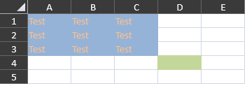
This example sets cell themes.
| CS |
Copy Code |
|---|---|
| gcSpreadSheet1.Sheets[0].Cells[0, 0, 2, 2].BackgroundThemeColor = "Accent 1 40"; gcSpreadSheet1.Sheets[0].Cells[3,3].BackgroundThemeColor = "Accent 3 40"; gcSpreadSheet1.Sheets[0].Cells[0,0,2,2].ForegroundThemeColor = "Accent 6 40"; //gcSpreadSheet1.Sheets[0].Cells[0,0,2,2].FontTheme = "Headings"; gcSpreadSheet1.Sheets[0].Cells[0, 0, 2, 2].Text = "Test"; | |
| VB |
Copy Code |
|---|---|
| gcSpreadSheet1.Sheets(0).Cells(0, 0, 2, 2).BackgroundThemeColor = "Accent 1 40" gcSpreadSheet1.Sheets(0).Cells(3, 3).BackgroundThemeColor = "Accent 3 40" gcSpreadSheet1.Sheets(0).Cells(0, 0, 2, 2).ForegroundThemeColor = "Accent 6 40" 'gcSpreadSheet1.Sheets(0).Cells(0, 0, 2, 2).FontTheme = "Headings" gcSpreadSheet1.Sheets(0).Cells(0, 0, 2, 2).Text = "Test" | |