A column chart represents data in vertical bars across the plot area on a horizontal axis. This type of chart is ideal for performing comparisons and analysis between two or more categories of data.
The data arranged in columns or rows of a worksheet can be plotted in a column chart.
SpreadJS supports the following three types of column chart. In the examples shown below, the annual sales record for Quarter 1, Quarter 2 and Quarter 3 for different categories of gadgets: Mobile Phones, Laptops and Tablets is depicted in different types of column charts.
-
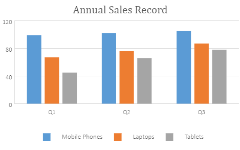
Clustered Column Chart
A clustered column chart can be used when you want to compare different values across different categories and show them in two-dimensional or three-dimensional vertical rectangles. This chart can be stacked normally in a regular way just like any other chart.
An image of the clustered column chart is shown below:
-
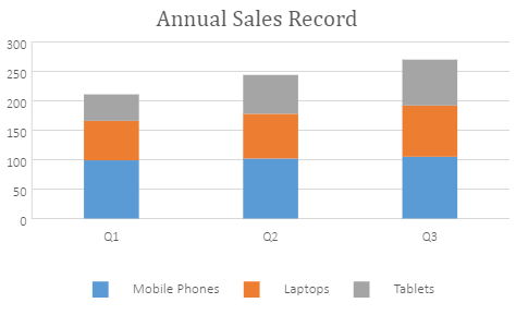
Stacked Column Chart
A stacked column chart can be used when you want to display the relationship of specific items to the whole across different categories and plot values in two-dimensional or three-dimensional vertical rectangles. This chart stacks the data series vertically (in a vertical direction).
An image of the stacked column chart is shown below:
-
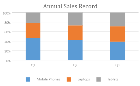
100% Stacked Column Chart
A 100% stacked column chart can be used when you want to perform comparisons of the percentages that each of the values are contributing to the total, across all your categories in the spreadsheet. This chart stacks the data series vertically and also equalizes the plotted values to meet 100%. The plotted values are displayed in two-dimensional and three-dimensional rectangles.
An image of the clustered column chart is shown below:
Using Code
This code shows how to add the three types of column chart in a spreadsheet.
| JavaScript |
Copy Code
|
|---|---|
|
var chart_columnClustered, chart_columnStacked, chart_columnStacked100, sheet; window.onload = function () { //prepare data for chart //add columnClustered chart //add columnStacked chart //add columnStacked100 chart sheet.resumePaint(); |
|