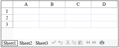
The command bar is a tool bar that is displayed at the top or bottom of the component. This bar includes the sheet name tabs (if there is more than one sheet) and the command buttons. By default, page navigation aids are also displayed on the command bar but can be repositioned or not displayed on the command bar.

Customizations
The customizations are made possible with the CommandBarInfo object. You can do the following customizations:
- Customize the color of the command bar
- Customize the font style of the text in the sheet name tabs and buttons
- Hide the command bar if there is only one sheet
- Set the position of the command bar to be either at the top or bottom of the component
To set the color of the command bar, use the BackColor property. To change the font of the text that appears in the buttons, use the Font property.
To hide the command bar when there is only one sheet (and thus no sheet name tabs to display), use the Visible property.
By default, the command bar is displayed at the bottom of the component. You can display it at the top by setting the CommandBarOnBottom property in the FpSpread class.
| Command Bar Position | Example Spread |
|---|---|
|
On Top |
|
|
On Bottom |
|
Postbacks
Several, but not all, of the buttons in the command bar trigger a postback to the server. These include:
- Delete button (AJAX postback)
- Print button
- Pager buttons (AJAX postback)
- Sheet buttons (AJAX postback)
- Update button (AJAX postback)
For information on other aspects of the appearance of the command bar buttons, refer to Customizing the Command Buttons.
Using the Properties Window
- Select the FpSpread component.
- With the Properties window open, select the CommandBar property drop-down list, and set any of the command bar properties. In order to set the BackColor setting for the command bar, set the Enable property to False in the Background section.
Using Code
Use the properties of the FpSpread class to define the position of the command bar and use the command bar properties to customize the look of the command bar.
Example
In this example, set the command bar to display at the top of the component and set the color to yellow.
| C# |
Copy Code
|
|---|---|
FpSpread1.CommandBarOnBottom = false; FpSpread1.CommandBar.Background = null; FpSpread1.CommandBar.BackColor = Color.Yellow; |
|
| VB |
Copy Code
|
|---|---|
FpSpread1.CommandBarOnBottom = False FpSpread1.CommandBar.Background = Nothing FpSpread1.CommandBar.BackColor = Color.Yellow |
|
Using the Spread Designer
- Select the Settings menu.
- Select the Command Bar icon under the Spread Settings section (the property grid has additional settings that are not available in the designer).
- Select the various options.
- Click Apply and OK.
- Click Apply and Exit to close the Spread Designer.

