This tutorial explains how the calendar is divided into sections for drawing purposes. To simplify and categorize the drawing functions, the calendar control was divided into four major parts: control, title bar, weekday title, and day area.
| Control | The control area is where all of the calendar months will be drawn and displayed. |
| Title Bar | The title bar area is where the year and month title for each calendar month is displayed. This will be displayed above the weekday titles. |
| Weekday Title | The weekday title is displayed between the title bar and the day area. All that is needed is to specify how one weekday title should look, and the remaining weekdays will use the same settings. |
| Day Area | The day area is displayed under the weekday title. Just like the weekday title, all that is needed is to design how one day cell should look, and the remaining days will use the same settings. |
-
Start a new project.
-
From the Visual Basic Project menu, select Components, then check the box labeled ComponentOne True DBCalendar 8.0. Click OK to add the TDBCalendar control icons to the Toolbox.
-
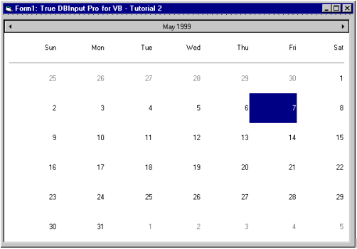
Place a True DBCalendar control (TDBCalendar1) on the form (Form1) as shown in the following figure. Watch the size panel in the Toolbar as you create the control to make it approximately 5000x8700, or set the Width and Height properties after creating the control.
-
Using the StyleSets property page of TDBCalendar1, choose the Insert button to add a new style. Set the following for that style: Key:objects to 3d, AlignH to 2 - Center, AlignV to 2 - Center, Bevel to 1, BevelLight to 25, BevelShade to 25, Border to 1 - Fixed Single, Font3D to 0 - Normal, choose the Colors button to set the BackColor to Gray and the ForeColor to Black.
To learn how to access property pages see Property Pages.
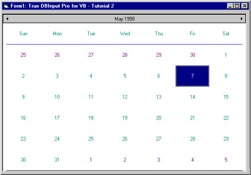
Using the StyleSets property page of TDBCalendar1, choose the Insert button to add a new style. Set the following for that style: set Key:objects to flat, and choose the Colors button to set the BackColor to White and the ForeColor to Dark Blue.
-
Using the Attributes property page of TDBCalendar1, set it to the SelAttrib. Set the following for that style: Bold to False, Underline to False, choose the Colors button to set the BackColor to Red and the ForeColor to White.
-
Using the SetEffect property page of TDBCalendar1, set the following: TitleStyleSet to 3d, WeekStyleSet to flat, and DayStyleSet to flat. See how the control looks at this point.
-
Using the Lines property page of TDBCalendar1, set the LineStyle to 3 and click on the option button next to Single. Click on the Colors button to change the color to blue. Set the LineStyle to 6 and click on the option button next to Thick. Click on the Colors button to change the color to black.
With the provided places to draw the lines and all of the line styles that are supported, you can draw any kind of line combinations on the weekday and day areas: thick outline borders, thick lines at the top and bottom, double lines for weekday separators, and so on. Experiment with these settings.
-
Using the General property page of TDBCalendar1, set the ShowTrailingDays to Checked.
-
Using the Attributes property page of TDBCalendar1, set it to the TrailAttrib. Set the following for that style: Bold to False, Underline to False, and choose the Colors button to set the BackColor to White and the ForeColor to DarkMagenta.
Run the program and observe the following:
At this point we have covered most of the drawing that will be done in the control - so let's see how the calendar control looks now. The calendar should have a 3D title bar, 2D weekday title, and day cells with dark cyan words against a white background. Also a thin blue line will be used for the weekday separator, and a black line will be drawn under the day area. The trailing days should appear in dark magenta.
To simplify the drawing of the calendar, the control provides a few default calendar templates through the Templates property that you can use. After you choose a default calendar template, you can make the necessary minor changes.
This concludes Tutorial 2.