You can use the VisualStyle, VisualStylePath, and UseEmbeddedVisualStyles properties to create a custom visual style for your C1TabStrip control. This topic assumes that you have created a C1TabStrip object with at least two tabs.
For more information on custom visual styles, see Custom Visual Styles.
In Design View
Complete the following steps:
1. In order to add a custom visual style to your project, you must first create new folders and add your .css file to the project. To do this, follow these steps:
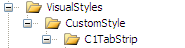
a. In the Solution Explorer window, right-click on your project to open its context menu and select New Folder. Name the new folder "VisualStyles".
b. Add a new folder within the VisualStyles folder and name it "CustomStyle".
c. Add another folder,"C1TabStrip", under the CustomStyle folder that you made in the last step. Your folder hierarchy should match the following image:
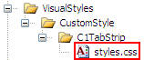
d. Right-click the C1TabStrip folder and select Add Existing Item to add your custom .css file to the project folder. Name the .css file "styles.css".
The styles.css file is added to your project.
2. In Solution Explorer, double-click styles.css to open the style sheet and replace the existing CSS body style with the following CSS styles:
/* =========== CustomStyle C1TabStrip =========================================== */
.C1TabStrip_CustomStyle .C1List
{
margin:0;
padding:0;
display:block;
}
.C1TabStrip_CustomStyle_C1Top .C1List,
.C1TabStrip_CustomStyle_C1Bottom .C1List
{
float:left;
}
.C1TabStrip_CustomStyle_C1Left .C1List,
.C1TabStrip_CustomStyle_C1Right .C1List
{
width:100px;
}
.C1TabStrip_CustomStyle .C1ListItem .C1Link
{
color:#ffffff;
text-decoration:none;
font-family:Comic Sans MS;
font-size:small;
font-weight:bolder;
background-color:#000000;
margin:-1;
padding:.6em;
cursor:pointer;
}
.C1TabStrip_CustomStyle_C1Top .C1ListItem
{
border-top:solid 2px #696969;
border-right:solid 2px #696969;
}
.C1TabStrip_CustomStyle_C1Bottom .C1ListItem
{
border-bottom:solid 2px #696969;
border-right:solid 2px #696969;
}
.C1TabStrip_CustomStyle_C1Left .C1ListItem,
.C1TabStrip_CustomStyle_C1Right .C1ListItem
{
border-top:solid 2px #696969;
border-left:solid 2px #696969;
}
.C1TabStrip_CustomStyle_C1Top .C1ListItem .C1Link,
.C1TabStrip_CustomStyle_C1Bottom .C1ListItem .C1Link,
.C1TabStrip_CustomStyle_C1Left .C1ListItem .C1Link,
.C1TabStrip_CustomStyle_C1Right .C1ListItem .C1Link
{
border: inset 1px #ffffff;
}
.C1TabStrip_CustomStyle .C1ListItem .C1Link:hover
{
background-color:Red;
}
.C1TabStrip_CustomStyle .C1ListItem .C1Selected
{
background-color:White;
color:Black;
}
.C1TabStrip_CustomStyle_C1Top .C1FirstItem .C1Link,
.C1TabStrip_CustomStyle_C1Bottom .C1FirstItem .C1Link
{
border-left:solid 2px #999;
}
.C1TabStrip_CustomStyle_C1Left .C1LastItem .C1Link,
.C1TabStrip_CustomStyle_C1Right .C1LastItem .C1Link
{
border-bottom:solid 2px #999;
}
.C1TabStrip_CustomStyle_C1Top .C1Inner,
.C1TabStrip_CustomStyle_C1Bottom .C1Inner
{
display:block;
text-align:center;
}
.C1TabStrip_CustomStyle_C1Left .C1Inner,
.C1TabStrip_CustomStyle_C1Right .C1Inner
{
display:block;
text-align:left;
white-space:nowrap;
overflow:hidden;
text-overflow:ellipsis;
}
3. Click C1TabStrip's smart tag and select TabStrip Designer from the tasks menu.
The C1TabStrip Designer Form opens.
4. In treeview, select C1TabControl1 to reveal its list of properties and then complete the following:
• Set the UseEmbeddedVisualStyles property to False.
• Set the VisualStylePath property to "~/VisualStyles".
• Set the VisualStyle property to CustomStyle (external).
Note: If CustomStyle(external) does not appear in the drop-down list, run the project and then repeat step 4.
5. Click OK to close the C1TabStrip Designer Form. Observe that the C1TabStrip has adopted your custom visual style.
In Source View
Complete the following steps:
1. Complete steps 1 and 2 under "Adding Custom Styles in Design View".
2. Enter Source view and enter VisualStyle="CustomStyle", VisualStylePath="~/VisualStyles", and UseEmbeddedVisualStyles="False" into the <cc1:C1TabStrip> tag. Your HTML will resemble the following:
<cc1:C1TabStrip ID="C1TabStrip1" runat="server" VisualStyle="CustomStyle" VisualStylePath="~/VisualStyles" UseEmbeddedVisualStyles="False">
3. Run the project and observe that the C1TabStrip has adopted your custom visual style.
In Code
Complete the following steps:
1. Complete steps 1 and 2 under "Adding Custom Styles in Design View".
2. Double-click the Web project to place a Page_Load event in the code editor.
3. Set the UseEmbeddedVisualStyles to False by adding the following code to the Page_Load event:
C1TabStrip1.UseEmbeddedVisualStyles = False
• C#
C1TabStrip1.UseEmbeddedVisualStyles = false;
4. Change the VisualStylePath property:
C1TabStrip1.VisualStylePath = "~/VisualStyles"
• C#
C1TabStrip1.VisualStylePath = "~/VisualStyles";
5. Select the custom visual style:
C1TabStrip1.VisualStyle = "CustomStyle"
• C#
C1TabStrip1.VisualStyle = "CustomStyle";
6. Run the project and observe that the C1TabStrip has adopted your custom visual style.
 This topic illustrates
the following:
This topic illustrates
the following:
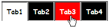
In this topic, you learned how to create a custom visual style. When you run the project, note that the tabs have images for three different states: normal, selected, and hover. The result of this topic will resemble the following image:
|