You can customize the FlexGrid control with a list of built-in themes provided by Cloud Business App Edition. Select a theme of your choice to enhance the grid's appearance. These themes are automatically added to your application under content folder.
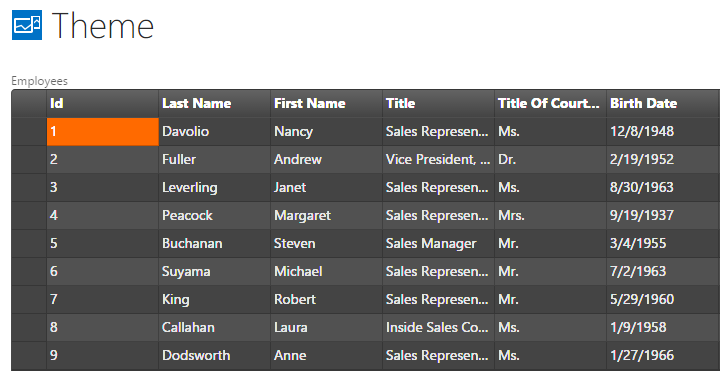
The following image shows how the FlexGrid appears after applying wijmo.theme.dark.min.css theme. The example uses DemoServiceData.Employees data from http://lsdemo.componentone.com/DataServices/Demo.svc.
To write code in JavaScript:
| JavaScript |
Copy Code
|
|---|---|
myapp.Theme.FlexGrid_render = function (element, contentItem) { $(element).addClass("custom-flex-grid"); if ($("#customCss").length == 0) { $("<link id='customCss' rel='stylesheet' type='text/css' href='Content/wijmo.theme.dark.min.css' />").appendTo($("head")); } var grid = new c1.cba.FlexGrid($(element), contentItem); var collectionView = new c1.cba.LightSwitchCollectionView(contentItem); grid.wjControl.itemsSource = collectionView; }; |
|