FlexGrid has an itemFormatter property that gives you complete control over the content of the cells. You can use JavaScript to customize, validate and categorize cell data in a grid.
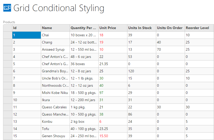
The following image shows how the FlexGrid appears after using itemFormatter property to categorize Unit Price column. This displays values that are less than 20 in red; and more than 30 in green. The example uses DemoServiceData.Products data from http://lsdemo.componentone.com/DataServices/Demo.svc.
To write code in JavaScript:
| JavaScript |
Copy Code
|
|---|---|
myapp.GridConditionalStyling.FlexGrid_render = function (element, contentItem) { var grid = new c1.cba.FlexGrid($(element), contentItem); var collectionView = new c1.cba.LightSwitchCollectionView(contentItem); grid.wjControl.itemsSource = collectionView; grid.wjControl.itemFormatter = function (panel, r, c, cell) { // get the color used to display an amount var getUnitPriceColor = function (UnitPrice) { return UnitPrice < 20 ? 'red' : UnitPrice < 30 ? 'black' : 'green'; }; // validate CellType and if correct column if (wijmo.grid.CellType.Cell == panel.cellType && panel.columns[c].binding == 'UnitPrice') { // get the cell's data var cellData = panel.getCellData(r, c); // set cell's foreground color cell.style.color = getUnitPriceColor(cellData); } }; }; |
|