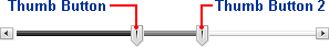
The C1Slider control includes two thumb buttons. The first main thumb button and a second thumb button used for selecting a value range. By default the first thumb button is visible and the second is not visible. The value of the first thumb button is defined by the Value property. The value of the second thumb button is defined by the Value2 property.
The main thumb button of the C1Slider control can be moved on the slider track through a drag-and-drop operation or by pressing the Increment and Decrement buttons. The second thumb button can also be moved by a drag-and-drop operation, but cannot be moved by clicking the Increment and Decrement buttons as these buttons only effect the Value property.
By default, if no Value has been set, the main slider thumb will appear on the slider track next to the decrement button at run time – the left side of the control if Orientation is set to Horizontal and the top of the control if Orientation is set to Vertical:
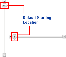
The second slider thumb appears at the opposite end of the slider track by default – the right side of the control if Orientation is set to Horizontal and the bottom of the control if Orientation is set to Vertical.
By default the first thumb is visible on the track and the ShowThumbButton property is set to True. If you do not wish the thumb to be visible, you can set the ShowThumbButton property to False. The C1Slider will appear similar to the following:
Note that value of the C1Slider control can still be changed by clicking on the slider's track or by clicking the Increment and Decrement buttons, but the thumb will not be seen. By default the second thumb button is not visible. To set it to be visible, set the ShowThumbButton2 property to True.
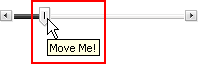
You can set the ThumbToolTip and Thumb2ToolTip properties if you want text to appear when the mouse hovers over the slider's thumb buttons. This can be helpful to state the slider's current value or prompt the user for an action. For example, in the following image the ThumbToolTip property was set to "Move Me!":
By default the ThumbToolTip and Thumb2ToolTip properties are not set and no ToolTips will appear on the slider's thumb buttons.
|