You can customize the C1Slider control appearance with your own images and styles by creating a custom visual style. All of C1Slider's style settings are controlled by style sheets. In the following example you'll create a custom style sheet to change the appearance of a horizontal slider control. For additional information, see Custom Visual Styles.
1. Create a new ASP.NET AJAX-Enabled Web Site. For more information, see Creating an AJAX-Enabled ASP.NET Project.
2. In Design view, navigate to the Visual Studio Toolbox and double-click the C1Slider icon to add the control to your page.
3. In the Solution Explorer, right-click the Web site and select New Folder to add a new folder to your project. Name the folder VisualStyles.
4. Right-click the VisualStyles folder and select New Folder to add a new folder. Name the folder Custom.
5. Right-click the Custom folder and select New Folder to add a new folder. Name the folder C1Slider.
6. Right-click the C1Slider folder and select New Folder to add a new folder. Name the folder Images.
7. Right-click the C1Slider folder and select Add New Item.
8. In the Add New Item dialog box, select Style Sheet. Name the file styles.css and select Add to close the dialog box and add the style sheet to your project.
Note that your file structure should look similar to the following image:
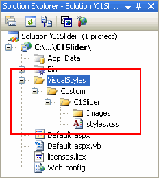
This structure, ~/VisualStyles/StyleName/C1Slider/styles.css, is the default file structure and file name that the VisualStylePath property will look in for the VisualStyle.
9. Double-click the styles.css item in the Solution Explorer if is not open. Add the following text to the style sheet to create a custom horizontal visual style:
/*--Set the C1Slider control's positioning.--*/
.C1Slider_Custom-C1Horizontal
{
-moz-user-select: none; font-size:1px; float:left; text-align:left;
width:200px; height:30px; position:relative;overflow:hidden;
}
/*--Set the decrement button's appearance.--*/
.C1Slider_Custom-C1Horizontal .C1DecButton
{
background-image:url('Images/dec_btn.png'); background-position:left center;
position:absolute;width:15px; height:12px; left:0px; top:9px;display:block;
}
/*--Set the track's appearance.--*/
.C1Slider_Custom-C1Horizontal .C1Track
{
background-image:url('Images/track.png');
background-position:center; background-repeat:repeat-x;
height:10px;display:block; position:absolute; left:15px; top:10px; width:170px;
}
/*--Set the increment button's appearance.--*/
.C1Slider_Custom-C1Horizontal .C1IncButton
{
background-image:url('Images/inc_btn.png'); background-position:left center;
position:absolute; width:15px; height:12px; right:0px; top:9px;
}
/*--Set the track selected region's appearance.--*/
.C1Slider_Custom-C1Horizontal .C1SelectedRegion
{
background-image:url('Images/selected.png');
background-repeat:repeat-x; background-position:center;
position:absolute; width:0px; height:10px;
}
/*--Set the thumb button's appearance.--*/
.C1Slider_Custom-C1Horizontal .C1Thumb
{
background-image:url('Images/thumb.png'); background-position:left center;
background-repeat:no-repeat;
position:absolute; top:-3px; width:12px; height:20px; left:0px;
}
10. Right-click the Images folder in the Solution Explorer and select Add Existing Item to locate and add images for the slider track and selected region and increment, decrement, and thumb buttons.
In the style sheet above, the following images were used:
|
Image |
Name |
Size |
|
|
dec_btn.png |
20 x 18 pixels |
|
|
track.png |
160 x 10 pixels |
|
|
inc_btn.png |
20 x 18 pixels |
|
|
selected.png |
1 x 10 pixels |
|
|
thumb.png |
9 x 13 pixels |
You can add your own images, or use the images above. To use the above images, right-click each image in the table above and select Copy. Paste the image into a paint program of your choice and save it with the name and dimensions indicated above.
11. Select Default.aspx to return to your page.
12. Click the C1Slider control to select it and, in the Properties window, set the following properties:
• Set the UseEmbeddedVisualStyles property to False.
• Set the VisualStylePath property to "~/VisualStyles".
• Set the VisualStyle property to "Custom".
These settings will set the C1Slider control to not use the built-in visual styles, to look in the directory you created for visual styles to use, and to use the visual style you created (named "Custom") as its current visual style.
Run your application and observe:
The slider will look similar to the following image:
|