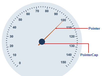
The C1RadialGauge control includes a pointer which indicates the selected C1Gauge.Value of the control. The pointer consists of the C1Gauge.Pointer element and the C1RadialGauge.Cap element:

The C1Gauge.Pointer element appears by default as a blue tapering element, but you can customize the appearance of the C1Gauge.Pointer element by setting several properties in the GaugePointer class, including the GaugePointer.Length, GaugePointer.Offset, GaugePointer.Shape, GaugePointer.PointerStyle, GaugePointer.Template, GaugePointer.Visible, and GaugePointer.Width properties.
In the image above, the C1Gauge.Pointer element is customized:
<!—Pointer -->
<Pointer Length="1" Width="4" Offset="0.15">
<PointerStyle Stroke="#BF551C">
<Fill Color="#BF551C">
</Fill>
</PointerStyle>
</Pointer>
The C1RadialGauge.Cap element appears by default as a blue circle, but you can customize the appearance of the C1RadialGauge.Cap element by setting several properties in the C1RadialGaugePointerCap class, including the C1RadialGaugePointerCap.BehindPointer, C1RadialGaugePointerCap.Radius, C1RadialGaugePointerCap.PointerCapStyle, C1RadialGaugePointerCap.Template, and C1RadialGaugePointerCap.Visible properties.
In the image above, the C1RadialGauge.Cap element is customized:
<!—Pointer Cap -->
<Cap>
<PointerCapStyle Stroke="#7F9CAD">
<Fill Color="#7F9CAD">
</Fill>
</PointerCapStyle>
</Cap>