The following example renders a combo list that appears when the user presses the custom button. This example uses the C1MaskedInput control.
Add a custom button:
To implement a custom button for the C1MaskedInput control, complete the following steps:
1. Select the C1MaskedInput control.
2. From the Properties window, set the CustomButtonAlign property to Right.
Add the client-side function for Combo List initialization:
To add an event handler to render a combo list when the custom button is pressed, complete the following steps:
1. Select the C1MaskedInput control.
2. From the Properties window, locate the client-side event, OnClientInit.
3. Click the OnClientInit drop-down arrow and select Add New Client Side Handler.
4. Your screen will automatically change to Source view and highlight the new function. Enter code so the OnClientInit function looks like the following (you will be replacing the code comment which is automatically inserted):
<script type="text/javascript" id="ComponentOneClientScript">
function C1MaskedInput1_OnClientInit(aC1Edit) {
var aComboItems = new Array();
aComboItems.push({ text: "C1Accordion", value: "C1Accordion" });
aComboItems.push({ text: "C1Calendar", value: "C1Calendar" });
aComboItems.push({ text: "C1Expander", value: "C1Expander" });
aComboItems.push({ text: "C1Menu", value: "C1Menu" });
aComboItems.push({ text: "C1NavPanel", value: "C1NavPanel" });
aComboItems.push({ text: "C1Slider", value: "C1Slider" });
aComboItems.push({ text: "C1Splitter", value: "C1Splitter" });
aComboItems.push({ text: "C1TabControl", value: "C1TabControl" });
aComboItems.push({ text: "C1TabStrip", value: "C1TabStrip" });
aComboItems.push({ text: "C1TreeView", value: "C1TreeView" });
aComboItems.push({ text: "C1Window", value: "C1Window" });
aC1Edit.setComboItems(aComboItems);
};
</script>
This topic illustrates the following:
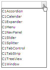
Run the project. Click the custom button and the list of combo items appears:
Select an item from the list for it to appear in the input box:
Note that for numeric controls, the type of combo value must be JavaScript float.
For the C1DateInput, control the value must be JavaScript Date type.
For example, combo items for C1DateInput can be initialized as follow:
<script type="text/javascript">
function C1DateInput1_OnClientInit(aC1Edit){
var aComboItems = new Array();
aComboItems.push( {text:"1980/4/8", value:new Date(1980,3,8)} );
aComboItems.push( {text:"2007/12/25", value:new Date(2007,11,25)} );
aComboItems.push( {text:"today", value:new Date()} );
aC1Edit.setComboItems(aComboItems);
};
</script>
</head>
<body>
<cc1:C1DateInput ID="C1DateInput1" runat="server" OnClientInit="C1DateInput1_OnClientInit" CustomButtonAlign="Right">
</cc1:C1DateInput>
Using HTML text in the combo list example:
var aImgSrc = 'Images/bullet_square_red.gif';
var aComboItems = new Array();
aComboItems.push( {text:'<IMG align="middle" SRC="' + aImgSrc + '"> 100,12$', value:100.12} );
aComboItems.push( {text:'<IMG align="middle" SRC="' + aImgSrc + '"> 1200$', value:1200} );
aComboItems.push( {text:'<IMG align="middle" SRC="' + aImgSrc + '"> 2000$', value:2000} );
aComboItems.push( {text:'<IMG align="middle" SRC="' + aImgSrc + '"> 5200$', value:5200} );
aC1Edit.setComboItems(aComboItems);
|