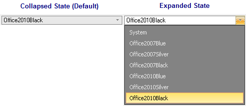
C1ComboBox is a composite control that is used for displaying a list of selectable items. It functions similar to the ListBox control, but it takes up less space since the items can be hidden. Items can be added to the C1ComboBox through the Items property or they could be bound to data via an arrary of strings or binding source. C1ComboBox includes the following elements: Textbox, Button, and DropDownList. In the textbox you can type anything or you can click the button to select an item from the DropDownList. For more information see C1ComboBox Elements. In its default state the C1ComboBox control appears collapsed and only displays one item inside the textbox area. In its expanded state the C1ComboBox control appears expanded and displays a dropdown listbox of selectable items.
The following image illustrates the C1ComboBox in its collapsed and expanded states:
In a typical combobox control, a dropdown button appears to the right and functions as a dropdownlist where you can quickly choose from a list of options. However, in C1ComboBox you can add more functionality and create a numeric up/down button to edit numeric values or you can add a modal button if you need to show a modal dialog in your combobox. For more information see C1ComboBox Button Appearance.