Use this screen to display a list of items in a grid that supports infinite scrolling, just like the built-in List control. In order to use this screen template, you must first install the NuGet package into the HTML Client project. See Installing the NuGet Client Package for instructions.
The order of the grid columns at runtime is determined by the order and visisbility of the collection properties under the Columns Layout element. That is, if a collection property has Is Visible unchecked in the designer, then a corresponding grid column will not be displayed.
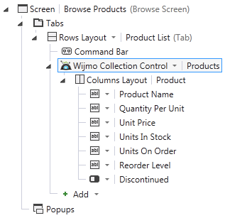
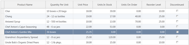
The grid derives data types from the collection’s view model and renders data values accordingly. For example, numeric values are right-aligned, and booleans are displayed as check boxes. Don’t interpret the control types used in the designer literally. In the example above, the Discontinued column will be rendered as check boxes even though a FlipSwitch control is specified in the designer. This is the expected behavior.
To perform an action when the user selects a grid row, set the Tap action on the Columns Layout element. Typically, you will use the collection’s viewSelected or editSelected method and navigate to the corresponding details screen. At runtime, the grid displays a record selector column on the left side.
Clicking the record selector for any row invokes the Tap action for that row. Alternatively, clicking anywhere in a row that is already selected invokes the Tap action for the selected row.
By default, clicking a column header performs a server-side sort on that column and refreshes the grid display accordingly. Clicking the column header again performs a descending sort. Only one column can be sorted at a time; secondary sorts are not supported. To disable sorting altogether, edit the generated script code and set the grid’s allowSorting property to false.