Row details template is a data panel that can be added to each row for displaying details. FlexGrid provides the flexibility to show information about each row through a template. You can embed text, UI elements, and data-bound controls, such as InputPanel, in the row details template. For each row, you can insert a data template to present its summary and show/provide details in other controls, such as text box, without affecting the dimensions of the grid. You can also use this template to create hierarchical grids displaying grouped data. In this example, we use row details template to display product-related information in FlexGrid.
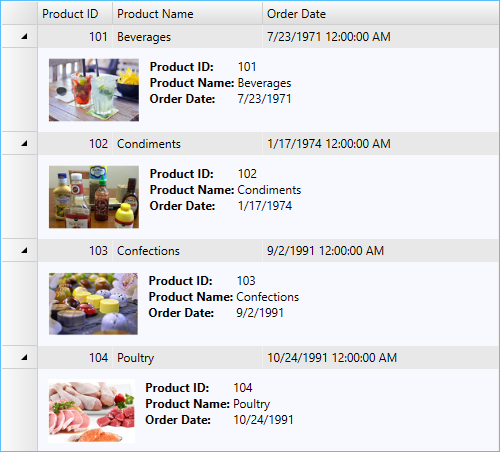
The following image shows details of each row displayed through a row details template.
To add row details template in FlexGrid
- Drag a grid control onto the XAML designer in a WPF application.
- Create three columns in the grid to display Product ID, Product Name and Order Date data fields.
XAML Copy Code<c1:C1FlexGrid.Columns> <c1:Column Header="Product ID" Binding="{Binding ProductId}" Width="75" /> <c1:Column Header="Product Name" Binding="{Binding ProductName}" Width="150" /> <c1:Column Header="Order Date" Binding="{Binding OrderDate}" Width="300" /> </c1:C1FlexGrid.Columns>
- Create a row details template in XAML that embeds an image control and six text block controls within a DockPanel.
XAML Copy Code<c1:C1FlexGrid.RowDetailsTemplate> <DataTemplate> <DockPanel Background="GhostWhite"> <Image DockPanel.Dock="Left" Name="img" Source="{Binding ImgSource}" Height="64" Margin="10" /> <Grid Margin="0, 10"> <Grid.ColumnDefinitions> <ColumnDefinition Width="Auto" /> <ColumnDefinition Width="*" /> </Grid.ColumnDefinitions> <Grid.RowDefinitions> <RowDefinition Height="Auto" /> <RowDefinition Height="Auto" /> <RowDefinition Height="Auto" /> </Grid.RowDefinitions> <TextBlock Text="Product ID: " FontWeight="Bold" /> <TextBlock Text="{Binding ProductId}" Grid.Column="1" /> <TextBlock Text="Product Name: " FontWeight="Bold" Grid.Row="1" /> <TextBlock Text="{Binding ProductName}" Grid.Column="1" Grid.Row="1" /> <TextBlock Text="Order Date: " FontWeight="Bold" Grid.Row="2" /> <TextBlock Text="{Binding OrderDate, StringFormat=d}" Grid.Column="1" Grid.Row="2" /> </Grid> </DockPanel> </DataTemplate> </c1:C1FlexGrid.RowDetailsTemplate>
- In the MainWindow.xaml.cs file, create a class, User, to add data in the grid.
- Populate the grid by creating a list, and bind the grid to the list using the ItemsSource property.