In many applications, cells have a well-defined list of possible values. In these cases, you can let users select the value from a drop-down list. To do this, build a string containing all the choices separated by pipe characters (for example, "True|False|Don't know") and assign it to the ComboList property. Each column may have a different list. Setting the ComboList property causes the grid to display a drop-down box next to the cell. The user can click the box (or press F2) to display the list of choices available for that cell.
Another common situation is where cells have a list of common values, but users should be allowed to type something else as well. This can be accomplished with drop-down combos, a combination of text box and drop-down list. To create combos, just start the choice list with a pipe character (for example "|True|False|Don't know"), then assign it to the ComboList property as before.
For example, the code below would cause the grid to display a drop-down combolist containing color names on column one, and a drop-down combo on column two. When editing column one, the user must pick a value from the list. When editing column two, the user can pick a value or type in something else:
To write code in Visual Basic
| Visual Basic |
Copy Code
|
|---|---|
' Drop-down list. _flex.Cols(1).ComboList = "Red|Green|Blue|Red|White" ' Drop-down combo. _flex.Cols(2).ComboList = "|Red|Green|Blue|Red|White" |
|
To write code in C#
| C# |
Copy Code
|
|---|---|
// Drop-down list. _flex.Cols[1].ComboList = "Red|Green|Blue|Red|White"; // Drop-down combo. _flex.Cols[2].ComboList = "|Red|Green|Blue|Red|White"; |
|
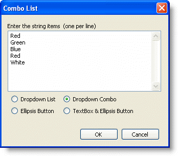
The ComboList property can also be set at design time using the Combo List dialog box. The Combo List dialog box allows you to choose if you want the list to appear as a Dropdown List, Dropdown Combo, Ellipsis Button, or TextBox and Ellipsis Button.

The Combo List dialog box can be accessed through the Column Tasks menu or through the C1FlexGrid Column Editor.
- In the Column Tasks menu, click the ellipsis button in the Combo List box.
- In the C1FlexGrid Column Editor, locate the ComboList property in the left pane, and click the ellipsis button next to it.
Note: The Combo List dialog box is column specific and will only change the ComboList property of the selected column.
In some cases, cells in the same column may need different lists. For example, a property list may show properties on the first column and their values on the second. The values depend on the property, so valid choices change from one row to the next. In these cases, you should trap the BeforeEdit event and set the ComboList property to the appropriate list for the current cell. The ComboList property applies to the whole grid.
The built-in ComboBox provides an auto-search feature by default. As the user types a value, the selection will move to the next match. You can disable this feature using the EditOptions property and control the time before the grid resets the auto-search buffer using the AutoSearchDelay property.
The built-in ComboBox also has an auto-cycle feature like the editors in the Visual Studio Properties window. When you double-click a cell that has a list associated with it, the grid will automatically select the next value. You can also disable this feature using the EditOptions property.