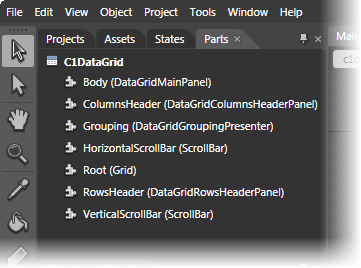
In Microsoft Expression Blend, you can view and edit template parts by creating a new template (for example, click the C1DataGrid control to select it and choose Object | Edit Template | Edit a Copy). Once you've created a new template, the parts of the template will appear in the Parts window:
Note that you may have to select the ControlTemplate for its parts to be visible in the Parts window.
In the Parts window, you can double-click any element to create that part in the template. Once you have done so, the part will appear in the template and the element's icon in the Parts pane will change to indicate selection:
Template parts available in the C1DataGrid control include:
| Name | Type | Description |
|---|---|---|
| Body | DataGridMainPanel | Panel that contains the body of the grid. |
| ColumnsHeader | DataGridColumnsHeaderPanel | Panel that contains a collection of DataGridColumnsHeaderPanel. |
| Grouping | DataGridGroupingPresenter | Presenter that displays the grouping panel or another element if there is no columns in the grouping panel. |
| HorizontalScrollBar | ScrollBar | Represents a control that provides a scroll bar that has a sliding Thumb whose position corresponds to a value. |
| Root | Grid | Definies a flexible grid area that consists of columns and rows. |
| RowsHeader | DataGridRowsHeaderPanel | Panel that contains DataGridRowsHeaderPanel. |
| VerticalScrollBar | ScrollBar | Represents a control that provides a scroll bar that has a sliding Thumb whose position corresponds to a value. |