FlexChart provides the option to display legend for denoting the type of data plotted on the axes. By default, the position of legend is set to "Auto", which means the legend positions itself automatically depending on the real estate available on the device. This allows the chart to efficiently occupy the available space on the device.
You can select where and how to display the legend by setting the LegendPosition property of the legend. You can also style the legend by setting its orientation through the LegendOrientation property, and adding a border through the Stroke property. You can also toggle the visibility of any series on clicking the corresponding legend item by setting the LegendToggle property to true.
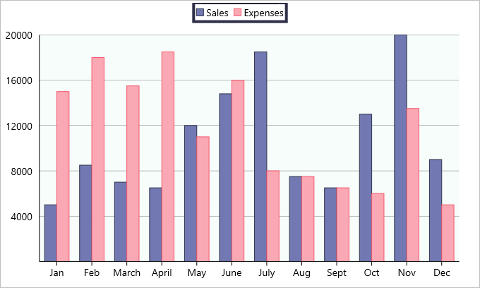
The image below shows how the FlexChart appears after these properties have been set.
- To hide the legend, set the LegendPosition property to None.
- The legend automatically wraps when LegendPosition property is set to Top or Bottom, orientation is set to Horizontal and there is not enough screen real estate.
The following code examples demonstrate how to set these properties in C# and XAML. This example uses the sample created in the Customize Appearance section.
In Code
| C# |
Copy Code |
|---|---|
chart.LegendToggle = true; chart.LegendPosition = ChartPositionType.Top; chart.LegendOrientation = Orientation.Horizontal; chart.LegendStyle.Stroke = Color.FromHex("#2D3047"); chart.LegendStyle.StrokeThickness = 4; | |
In XAML
| XAML |
Copy Code |
|---|---|
<c1:FlexChart x:Name="chart" ItemsSource="{Binding Data}" BindingX="Name" ChartType="Column" Grid.Row="1" Grid.ColumnSpan="2" VerticalOptions="FillAndExpand" LegendToggle="True" LegendPosition="Top" LegendOrientation="Horizontal"> <c1:FlexChart.LegendStyle> <c1:ChartStyle Stroke="#2D3047" StrokeThickness="4"></c1:ChartStyle> </c1:FlexChart.LegendStyle> </c1:FlexChart> | |