FlexGrid gives you complete control over the contents of the cells. You can customize each column’s appearance by modifying the CellTemplate or CellEditingTemplate properties in XAML, or you can create your own Cell Factory class to customize cell content entirely in code.
The following code example demonstrates how to add custom cell content in the FlexGrid control.
Custom Cells in XAML
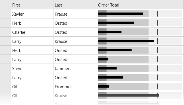
The CellTemplate and CellEditingTemplate properties are used to modify a column’s appearance in XAML. These properties accept a standard DataTemplate as their value. The following XAML example demonstrates how to add custom cell content, such as a BulletGraph, using the CellTemplate property on a specific column.
| XAML |
Copy Code |
|---|---|
<c1:FlexGrid AutoGenerateColumns="False" IsReadOnly="True"> <c1:FlexGrid.Columns> <c1:GridColumn Binding="First" Width="*"/> <c1:GridColumn Binding="Last" Width="*"/> <c1:GridColumn Binding="OrderTotal" Header="Order Total" Width="*"> <c1:GridColumn.CellTemplate> <DataTemplate> <gauge:C1BulletGraph IsAnimated="False" IsReadOnly="True" Value="{Binding OrderTotal}" Min="0" Max="10000" Bad="1000" Good="6000" Target="7000"/> </DataTemplate> </c1:GridColumn.CellTemplate> </c1:GridColumn> </c1:FlexGrid.Columns> </c1:FlexGrid> | |
For the best performance, your cell template should contain a single control (View). In this case, the Xamarin.Forms platform is capable of efficiently rendering single Views as bitmaps on Android and iOS so performance is not dramatically affected. If your cell template contains a layout control (such as a Grid or StackLayout), it will work, but a new View will be created for every cell on Android and iOS. This may drastically affect performance if you have a lot of rows. You can work around this limitation by creating a custom renderer. This limitation does not impact CellEditingTemplate because only one cell is in edit mode.
Custom Cells in Code
FlexGrid provides a simpler interface for customizing cells in code. The GridCellFactory class is used by the grid to create every cell shown in the grid. Custom cell factories can be highly customized, or they can be general, reusable classes for defining cell appearances.
To customize cells code, you first define your own class that extends GridCellFactory. Then you assign an instance of your class to the FlexGrid.CellFactory property. Your cell factory class should override either the BindCellContent method or the CreateCellContent method. To customize the gridlines appearance you should override CreateCell.
- BindCellContent: Override this method to customize the cell text. The result is a text-only cell, but you can conditionally format the text as needed.
- CreateCellContent: Override this method to completely customize the cell content. The result is a View (control). You would use this method to insert your own control, such as an Image or gauge.
- PrepareCell: Override this method to customize the cell background and border (gridlines).
The following code example demonstrates a cell factory that overrides BindCellContent and conditionally sets the cell text red or green depending on the value:
| C# |
Copy Code |
|---|---|
// set the cell factory property on FlexGrid to custom class grid.CellFactory = new MyCellFactory(); // Custom Cell Factory class that applies conditional formatting to cell text public class MyCellFactory :GridCellFactory { /// /// Override BindCellContent to customize the cell content /// public override void BindCellContent(GridCellType cellType, GridCellRange range, View cellContent) { base.BindCellContent(cellType, range, cellContent); if(cellType == GridCellType.Cell&&cellType != GridCellType.ColumnHeader&&range.Column == 3) { var label = cellContent as Label; if(label != null) { var originalText = label.Text; double cellValue; if(double.TryParse(originalText, out cellValue)) { label.TextColor = cellValue<70.0 ?Color.Red :Color.Green; label.Text = String.Format("{0:n2}", cellValue); } } } } } | |
FlexGrid supports just one cell factory, however, a single cell factory can handle any number of custom cells in multiple columns. For instance, you can apply different formatting for any number of columns by just providing additional IF statements and checking the range.Column parameter.
The following code example shows the default CreateCellContent method that returns a Label as the cell content. You can modify this to return your own View.
In Code
| C# |
Copy Code |
|---|---|
public class MyCellFactory: GridCellFactory { /// /// Override CreateCellContent to return your own custom view as a cell /// public override View CreateCellContent(GridCellType cellType, GridCellRange range, object cellContentType) { if (cellType == GridCellType.Cell) { if (Grid.Columns.Count>range.Column) { var r = Grid.Rows[range.Row]; var c = Grid.Columns[range.Column]; return base.CreateCellContent(cellType, range, cellContentType); } return null; } else if (cellType == GridCellType.ColumnHeader) { return new Label(); } else { return null; } } } | |
The following code example shows how to customize cell background colors using PrepareCell.
In Code
| C# |
Copy Code |
|---|---|
public class MyCellFactory : GridCellFactory { /// /// Override CreateCell to customize the cell frame/gridlines /// public override void PrepareCell(GridCellType cellType, GridCellRange range, GridCellView cell) { base.PrepareCell(cellType, range, cell); if (cellType == GridCellType.Cell && range.Column == 3) { var cellValue = Grid[range.Row, range.Column] as int?; if (cellValue.HasValue) { cell.BackgroundColor = cellValue < 50.0 ? Color.FromRgb((double)0xFF / 255.0, (double)0x70 / 255.0, (double)0x70 / 255.0) : Color.FromRgb((double)0x8E / 255.0, (double)0xE9 / 255.0, (double)0x8E / 255.0); } } } } | |