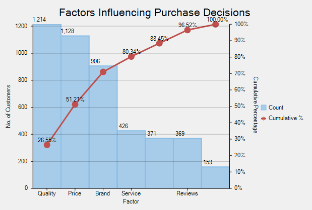
Pareto chart is a type of chart that contains both bar and a line chart. It is a vertical bar chart in which values are plotted in decreasing order of relative frequency from left to right. The categories or factors that represent the bigger bars on the left are more important than those on the right. The line chart plots the cumulative total percentage of frequencies that are represented by the bars.
Pareto chart is essentially used in scenarios where the data is broken into different categories, and when the developer needs to highlight the most important factors from a given set of factors. For example, quality control, inventory control, and customer grievance handling are some areas where Pareto chart analysis can be frequently used.
In FlexChart, Pareto chart can be easily created by combining RangedHistogram chart with any of Line, Spline, LineSymbol, or SplineSymbol chart. First, plot the relative frequency on a RangedHistogram in descending order. Then, calculate the cumulative relative frequency in percentage using original data to create another series which is plotted on any of the Line, Spline, LineSymbol, or SplineSymbol chart. This forms Pareto line of the chart which helps in identifying the added contribution of each category.
To implement Pareto chart using the FlexChart control, see FlexChartExplorer sample. The samples are available in the default installation folder - Documents\ComponentOne Samples\WinForms\C1FlexChart.