A heat map is a graphical representation of tabular data values through color coding and shading. It uses the two dimensional data where each value is mapped through a specified color palette. Heat map helps in identifying patterns, areas of concentration, and data variance. You can use the heat map chart to plot data like event schedule, temperature records, weekly traffic intensity, etc.
A heat map chart can showcase different visual representations depending upon the type of data. It can therefore be categorized into two types.
Category based heat map
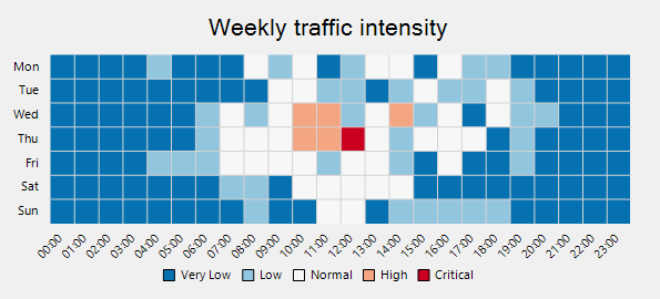
When you want to plot the data against intervals or specific numeric ranges, you can create a category based heat map. To implement category based heat map chart, you need to use the DiscreteColorScale class. It provides Intervals property that allows you to get or set the collection of intervals. Set the Min, Max, Color, and Name properties for each interval. So, the data points belonging to a particular interval are represented by the same color. The list of user-defined intervals is shown on the chart legend.
For example, if you use heat map chart to show the weekly traffic intensity of a city, you can use the DiscreteColorScale class and add intervals such as very low, low, normal, and set its corresponding min, max, and color property.
The following image shows a category based heat map.
Use the following code snippet to create a category based heat map.
| C# |
Copy Code
|
|---|---|
public partial class Loading : UserControl { public Loading() { InitializeComponent(); } private void Loading_Load(object sender, EventArgs e) { var chart = new FlexChart(); chart.Legend.Position = Position.Bottom; chart.Dock = DockStyle.Fill; chart.ChartType = ChartType.Scatter; chart.AxisX.MajorGrid = false; chart.AxisX.MinorGrid = true; chart.AxisX.MajorTickMarks = TickMark.None; chart.AxisX.AxisLine = false; chart.AxisX.MinorGridStyle.StrokeColor = Color.LightGray; chart.AxisY.MajorGrid = false; chart.AxisY.MinorGrid = true; chart.AxisY.MinorGridStyle.StrokeColor = Color.LightGray; chart.Header.Content = "Weekly traffic intensity"; chart.Header.Style.Font = new Font("Seqoe UI", 16); chart.ToolTip.Content = "{item:0.0}%"; var scale = new DiscreteColorScale() { Intervals = new List<DiscreteColorScale.Interval>() }; scale.Intervals.Add(new DiscreteColorScale.Interval(0, 10, Color.FromArgb(unchecked((int)0xFF0571B0)), "Very Low")); scale.Intervals.Add(new DiscreteColorScale.Interval(10, 25, Color.FromArgb(unchecked((int)0xFF92C5DE)), "Low")); scale.Intervals.Add(new DiscreteColorScale.Interval(25, 75, Color.FromArgb(unchecked((int)0xFFF7F7F7)), "Normal")); scale.Intervals.Add(new DiscreteColorScale.Interval(75, 90, Color.FromArgb(unchecked((int)0xFFF4A582)), "High")); scale.Intervals.Add(new DiscreteColorScale.Interval(90, 100, Color.FromArgb(unchecked((int)0xFFCA0020)), "Critical")); // generated some random data var rnd = new Random(); var data = new double[24, 7]; for (var j = 0; j < 7; j++) for (var i = 0; i < 24; i++) data[i, j] = 10 * Math.Exp(-(i - 12) * (i - 12) / (2 * 4.0 * 4.0)) / Math.Sqrt(2 * Math.PI * 4.0 * 4.0) * ((j == 5 || j == 6) ? 50 : 100) * rnd.NextDouble(); var hmap = new Heatmap(); hmap.DataSource = data; hmap.ColorScale = scale; chart.Series.Add(hmap); var times = new string[24]; for (var i = 0; i < 24; i++) times[i] = new DateTime(2000, 1, 1, i, 0, 0).ToShortTimeString(); chart.AxisX.DataSource = times; chart.AxisX.LabelAngle = 45; chart.AxisY.DataSource = new string[] { "Mon", "Tue", "Wed", "Thu", "Fri", "Sat", "Sun" }; chart.AxisY.Reversed = true; Controls.Add(chart); } } |
|
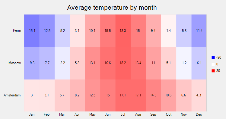
Value based heat map
When you want to plot the raw data values without dividing them into intervals, you can create a value based heat map. To implement the value-based heat map, you need to use the GradientColorScale class. By default, a heat map is rendered with the chart legend. Each legend entry corresponds to a numeric value between the Min and Max values. The interval used to generate the numeric values for the legend entries is calculated by using the formula (|Min| + |Max|)/(n-1) where n refers to the number of colors specified in the Colors property.
For example, a simple custom palette containing red, white and blue color maps the values from -30 to 30 to shades of red, white, blue, where -30 is mapped to red and 30 to blue.
The following image shows a value based heat map.
Use the following code snippet to create a value based heat map.
| C# |
Copy Code
|
|---|---|
public partial class Form1 : Form { public Form1() { InitializeComponent(); } private void Form1_Load(object sender, EventArgs e) { var chart = new FlexChart(); chart.Dock = DockStyle.Fill; chart.ChartType = C1.Chart.ChartType.Funnel; chart.AxisY.MajorGrid = false; chart.AxisX.AxisLine = false; chart.AxisX.MajorTickMarks = C1.Chart.TickMark.None; chart.Header.Content = "Average temperature by month"; chart.Header.Style.Font = new Font("Seqoe UI", 16); chart.Rotated = true; chart.PlotStyle.StrokeColor = Color.LightGray; chart.PlotStyle.StrokeWidth = 1; var scale = new GradientColorScale(); scale.Colors = new List<Color> { Color.Blue, Color.White, Color.Red }; scale.Min = -30; scale.Max = 30; var hmap = new Heatmap(); hmap.DataSource = new double[,] { { 3.0, 3.1, 5.7, 8.2, 12.5, 15.0, 17.1, 17.1, 14.3, 10.6, 6.6, 4.3 }, { -9.3, -7.7, -2.2, 5.8, 13.1, 16.6, 18.2, 16.4, 11.0, 5.1, -1.2, -6.1}, { -15.1, -12.5, -5.2, 3.1, 10.1, 15.5, 18.3, 15.0, 9.4, 1.4, -5.6, -11.4}, }; hmap.ColorScale = scale; hmap.DataLabel = new DataLabel(); hmap.DataLabel.Position = C1.Chart.LabelPosition.Center; hmap.DataLabel.Content = "{item}"; chart.Series.Add(hmap); chart.AxisX.DataSource = new string[] { "Jan", "Feb", "Mar", "Apr", "May", "Jun", "Jul", "Aug", "Sep", "Oct", "Nov", "Dec" }; chart.AxisY.DataSource = new string[] { "Amsterdam", "Moscow", "Perm" }; this.Controls.Add(chart); } } |
|
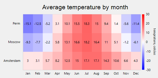
The default chart legend can be replaced with a gradient chart legend by using the ColorAxis class. Gradient chart legend is a small bar of integrated colors obtained from the Colors definitions. Each color is for a specific numeric range and it integrates with the next color, creating a gradient legend. Every point on the gradient legend represents a distinctive color and value. Therefore, all the dissimilar values in the chart appear in distinctive colors as per the position on the gradient legend.
To implement heat map with a gradient legend, you need to provide an instance of ColorAxis class to the Axis property provided by the GradientColorScale class. Moreover, you also need to specify the Min, Max and Colors property of GradientColorScale class to set up a gradient legend.
The following image shows a value based heat map with gradient legends.
Use the following code snippet to create a value based heat map with gradient legends.
| C# |
Copy Code
|
|---|---|
public partial class Form1 : Form { public Form1() { InitializeComponent(); } private void Form1_Load(object sender, EventArgs e) { var chart = new FlexChart(); chart.Dock = DockStyle.Fill; chart.ChartType = C1.Chart.ChartType.Scatter; chart.AxisY.MajorGrid = false; chart.AxisX.AxisLine = false; chart.AxisX.MajorTickMarks = C1.Chart.TickMark.None; chart.Header.Content = "Average temperature by month"; chart.Header.Style.Font = new Font("Seqoe UI", 16); chart.Rotated = true; chart.PlotStyle.StrokeColor = Color.LightGray; chart.PlotStyle.StrokeWidth = 1; var scale = new GradientColorScale(); scale.Colors = new List<Color> { Color.Blue, Color.White, Color.Red }; scale.Axis = new C1.Win.Chart.Extended.ColorAxis() { Position = Position.Right, Title = "temprature, celcius" }; scale.Min = -30; scale.Max = 30; var hmap = new Heatmap(); hmap.DataSource = new double[,] { { 3.0, 3.1, 5.7, 8.2, 12.5, 15.0, 17.1, 17.1, 14.3, 10.6, 6.6, 4.3 }, { -9.3, -7.7, -2.2, 5.8, 13.1, 16.6, 18.2, 16.4, 11.0, 5.1, -1.2, -6.1}, { -15.1, -12.5, -5.2, 3.1, 10.1, 15.5, 18.3, 15.0, 9.4, 1.4, -5.6, -11.4}, }; hmap.ColorScale = scale; hmap.DataLabel = new DataLabel(); hmap.DataLabel.Position = C1.Chart.LabelPosition.Center; hmap.DataLabel.Content = "{item}"; chart.Series.Add(hmap); chart.AxisX.DataSource = new string[] { "Jan", "Feb", "Mar", "Apr", "May", "Jun", "Jul", "Aug", "Sep", "Oct", "Nov", "Dec" }; chart.AxisY.DataSource = new string[] { "Amsterdam", "Moscow", "Perm" }; this.Controls.Add(chart); } } |
|
See Also