In the previous step you created a new project and added a Rectangle control with a gradient to the application. In this step you'll continue by adding C1ColorPicker controls that will control the gradient fill in the Rectangle.
Complete the following steps:
-
In Design view, click on the Rectangle to select it and navigate to the Visual Studio Toolbox.
-
In the Toolbox, locate and double-click the C1ColorPicker icon twice add two controls to the form.
-
Resize and position the two C1ColorPicker controls, so that they appear in the middle of the rectangle.
-
Click once on the first C1ColorPicker control, C1ColorPicker1, in Design view, navigate to the Properties window, and set the following properties:
-
Set DropDownDirection to AboveOrBelow to control how the control opens.
-
Set the Mode to Advanced so only the advanced color picker appears.
-
Set the SelectedColor to Black (or "#FF000000").
The XAML will appear similar to the following:
XAML
You'll leave the second C1ColorPicker control set to the default values.
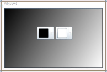
The page's Design view should now look similar to the following image:
You've successfully set up your application's user interface, but if you run your application right now the color pickers will do nothing if you select a color. In the next step you'll add code to your application to add functionality to the controls.