The Custom Preview sample demonstrates how to create various type of reports, customize the Viewer toolbar, load or save a report document file (RDF). The sample also provides six types of export options and demonstrates the use of print settings.
Sample Location
Visual Basic.NET
<User Folder>\Documents\GrapeCity Samples\ActiveReports 12\Section Reports\Preview\CustomPreview\VB.NET
C#
<User Folder>\Documents\GrapeCity Samples\ActiveReports 12\Section Reports\Preview\CustomPreview\C#
Run-Time Features
The Custom Preview sample consists of the parent CustomPreviewForm with menus, the child PreviewForm with the Viewer control, the ExportForm with the Properties window, the Reports folder, and the Resources folder.
When you run the sample, the CustomPreviewForm appears. It has three menus - File, Reports and Window.
The File menu allows you to perform the following operations.
- Open: Loads the report document file (RDF).
- Spreaduilder API: Creates an Excel file by the Spreadbuilder API.
- Export... This option is available with an opened report. Exports a report to six formats - HTML, Excel, Text, PDF, RTF, and TIFF.
- Save: This option is available with an opened report. Saves the opened report in the report document format (RDF).
- Exit: Closes the Custom Preview Sample form.
The Reports menu allows opening the sample reports by selecting them from the list. The available reports are described in detail below under Reports folder.
The Window menu allows navigating between the opened reports.
Note: To run this sample, you must have access to the Nwind.mdb. A copy is located at [User Documents folder]\GrapeCity Samples\ActiveReports 12\Data. If you are unable to access the data files in the sample, create the above folder to place all the data files or change the reference path to the data files within the folder according to your environment.
Project Details
CustomPreviewForm
PreviewForm
ExportForm
Resources folder
This folder contains the icons that are used in the File menu of the Custom Preview Sample form.
Reports folder
The Reports folder contains the following reports that demonstrate the Viewer and Export features.
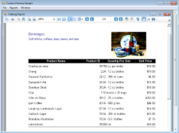
Catalog
CustomerLabels
Detail section
Click the gray report DataSource icon on the Detail section band to open the Report Data Source dialog, where you can see the Connection String and SQL Query that provide data for the bound fields.
The Detail section has bound TextBox and Label controls. Select a textbox and go to the DataField property in the Properties window to see a bound data field for this textbox.
The ColumnCount property is set to 2, which allows the report to display the labels in 2 columns. The ColumnDirection property is set to AcrossDown to have labels print in the left-to-right order instead of the top-to-bottom order.
EmployeeProfiles
PageHeader section
This section is used to display the document title and the text description at the top of each page.
Detail section
Click the gray report DataSource icon on the Detail section band to open the Report Data Source dialog, where you can see the Connection String and SQL Query that provide data for the bound fields.
The Detail section has a bound Picture control, bound TextBox and Label controls. Select a textbox and go to the DataField property in the Properties window to see a bound data field for this textbox.
This report uses bookmarks that you can see in the Document map of the Viewer sidebar, which is displayed if you click the Toggle sidebar button in the Viewer's toolbar. Right-click the report and select View Code to see how to use the unbound Textbox control and the Add.Bookmark method in the Detail_BeforePrint event to set the bookmarks in this report. See Linking in Reports and Add Bookmarks for details on using bookmarks in ActiveReports.
The KeepTogether property is set to True to print the section content on a single page.
PageFooter section
This section is not in use, so the Height property is set to 0. This section cannot be deleted because its related PageHeader section is in use.
EmployeeSales
ReportHeader section
This section contains Label controls, a bound Textbox control and a bound Chart control to display the title, total sales and the bar graph representation of the data.
GroupHeader1 section
The controls in this section include two Label controls to serve as column headers for the Detail section to follow.
Detail section
Click the gray report DataSource icon on the Detail section band to open the Report Data Source dialog, where you can see the Connection String and SQL Query that provide data for the bound fields.
The Detail section has bound TextBox and Label controls. Select a textbox and go to the DataField property in the Properties window to see a bound data field for this textbox.
GroupFooter1 section
This section is not in use, so the Height property is set to 0. This section cannot be deleted because its related GroupHeader1 section is in use.
Report Footer section
This section is not in use, so the Height property is set to 0. This section cannot be deleted because its related ReportHeader section is in use.
Invoice
PageHeader section
This section contains a Picture control with a logo, a number of Label controls, and two bound TextBox controls. The TextBoxes are bound using the DataField property in the Properties window, and the date is formatted using the OutputFormat property.
ghOrderID section
The DataField property of this section is also set to OrderID. This allows subtotal summary functions in the related GFOrderID section to calculate properly.
This section contains a number of labels and bound text boxes, as well as two Line controls.
The KeepTogether property is set to True to print the section content on a single page.
Detail section
Click the gray report DataSource icon on the Detail section band to open the Report Data Source dialog, where you can see the Connection String and SQL Query that provide data for the bound fields.
This section contains bound TextBox controls. These controls render once for each row of data found in the current OrderID before the report moves on to the Footer sections.
GFOrderID section
The NewPage property of this section is set to After. This causes the report to break to a new page and generate a new invoice after this section prints its subtotals.
This section contains several labels and several TextBoxes. Two of the TextBox controls use the following properties to summarize the detail data: SummaryFunc, SummaryGroup, and SummaryType. For more information, Create a Summary Report.
The Total TextBox does not use the DataField property or any of the summary properties, or even any code. Go to the Script tab at the bottom of the report to see how this TextBox is set.
The KeepTogether property is set to True to print the section content on a single page.
PageFooter section
This section has one simple Label control that contains a "Thank you" note. For more information about report sections and the order in which they print, see Section Report Structure and Section Report Events.
Letter
PageHeader section
This section contains the Picture control with a logo, the Line control, and the Label controls.
The CanGrow property is set to False to indicate that the controls are to be clipped to the section's height.
ghCustomerID section
This section has its DataField property set to CustomerID. This ensures that all details for one customer id are printed before the report moves on to the next customer id.
The section contains the Label controls, the RichTextBox control, and bound TextBox controls.
The RichTextBox control allows to create a mail-merge report where field place holders are replaced with values (merged) at run time. Right-click the report and select View Code to see how to use the ReplaceField method in the BeforePrint event to calculate total fields in the RichTextBox control.
The CanShrink property is set to True to have the section shrink to fit its controls.
The KeepTogether property is set to True to print the section content on a single page.
Detail section
Click the gray report DataSource icon on the Detail section band to open the Report Data Source dialog, where you can see the Connection String and SQL Query that provide data for the bound fields.
This section contains three bound TextBox controls.
The KeepTogether property is set to True to print the section content on a single page.
gfCustomerID section
This section contains two Label controls that display the note at the end of each letter to a customer.
The NewPage property is set to After to ensure that the report breaks to a new page before rendering the next section.
PageFooter section
This section contains the Label control that displays the address of the company.
The CanGrow property is set to False to indicate that the controls are to be clipped to the section's height.
See Also