The Map data region is a professional edition feature that shows your business data against a geographical background. You can create different types of map, depending on the type of information you want to communicate in your report.
The Map data region consists of the following basic elements:
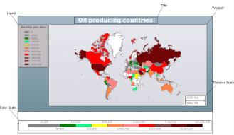
Title
Map Title describes the theme or subject of the map. The purpose of map title is to tell the viewer of what he is looking at. You can add multiple titles to the Map using the MapTitleDesigner Collection Editor.
For more information, see Create a Map.
Viewport
Viewport refers to the area on the map where data is displayed against a geographical background. It specifies the coordinates, projection system, parallels and meridians, center point, and scale of the map. In other words, it is a map element that actually displays geographical data and occupies most area of the map control depending on the location and dock position of other map elements. For more information, see Create a Map.
The Map Viewport dialog lets you set properties with the following pages.
General
Coordinate system: Specify the coordinate system of the viewport. Select from Planar, Geographic, or select the <Expression...> option to open the Expression Editor and create an expression.
Projection: Specify the projection of the map. Tile layers must use the Mercator projection.
Minimum X: Specify the minimum X coordinate of the map in degrees.
Maximum X: Specify the maximum X coordinate of the map in degrees.
Minimum Y: Specify the minimum Y coordinate of the map in degrees.
Maximum Y: Specify the maximum Y coordinate of the map in degrees.
Projection Center X: Specify the X coordinate of the projection center in degrees.
Projection Center Y: Specify the Y coordinate of the projection center in degrees.
Minimum zoom: Specify the minimum zoom value.
Maximum zoom: Specify the maximum zoom value.
Map resolution: Enables the viewport to simplify vector data for polygon and line layers.
Show grid lines below the map: Specify whether to show the grid lines above or below the content of the map.
Meridians
Hide meridians: Specify whether to hide meridians.
Interval: Specify the spacing between the grid lines in degrees.
Line
- Style: Choose from None, Dotted, Dashed, Solid, Double, Groove, Ridge, Inset, WindowInset, Outset, or select the <Expression...> option to open the Expression Editor and create an expression.
- Width: Specify the width of the line.
- Color: Select a Web or custom color for the line.
Show labels: Specify whether to show labels for meridians on the map.
Format: Specify the format string to display numeric labels.
Position: Specify the position of the meridians on the map.
Font
- Family: Choose the font family name.
- Size: Choose the size in points for the font.
- Style: Choose Normal or Italic.
- Weight: Choose from Lighter, Thin, ExtraLight, Light, Normal, Medium, SemiBold, Bold, ExtraBold, Heavy, and Bolder.
- Color: Select a Web or custom color for the font.
- Decoration: Choose from None, Underline, Overline, LineThrough, or select the <Expression...> option to open the Expression Editor and create an expression.
Parallels
Hide parallels: Specify whether to hide parallels.
Interval: Specify the spacing between the grid lines in degrees.
Line
- Style: Choose from None, Dotted, Dashed, Solid, Double, Groove, Ridge, Inset, WindowInset, Outset, or select the <Expression...> option to open the Expression Editor and create an expression.
- Width: Specify the width of the line.
- Color: Select a Web or custom color for the line.
Show labels: Specify whether to show labels for parallels on the map.
Format: Specify the format string to display numeric labels.
Position: Specify the position of the parallels on the map.
Font
- Family: Choose the font family name.
- Size: Choose the size in points for the font.
- Style: Choose Normal or Italic.
- Weight: Choose from Lighter, Thin, ExtraLight, Light, Normal, Medium, SemiBold, Bold, ExtraBold, Heavy, and Bolder.
- Color: Select a Web or custom color for the font.
- Decoration: Choose from None, Underline, Overline, LineThrough, or select the <Expression...> option to open the Expression Editor and create an expression.
View
Center and zoom: Specify how the map viewport zooms and centers during the report processing.
- Custom
- Center map to show a map element
- Center map to show a map layer
- Center map to show all map elements
View Center X: Specify the X coordinate of the current view center.
View Center Y: Specify the Y coordinate of the current view center.
Zoom level: Specify the zoom level of the map view.
Appearance
Border
- Style: Choose an enumerated style for the border.
- Width: Set a width value in points between 0.25pt and 20pt.
- Color: Select a Web or custom color for the border.
Background
- Color: Select a color to use for the background of the Viewport.
- Gradient: Select a color to use for the border, or select the <Expression...> option to open the Expression Editor and create an expression that evaluates to a .NET color.
- Gradient End Color: Select a color to use for the end color of the background gradient.
- Pattern: Select the hatching pattern of a report control.
Shadow offset: Specify the size of the shadow. Shadow offsets are drawn to the right and below an element.
Legend
A legend on a map provides valuable information to users for interpreting the map data visualization rules such as color, size, and marker type differences for map elements on a layer. By default, a single Legend item already exists in the legends collection which can be used by all layers to display items. You can also create additional legends to use them individually with layers that have associated rules to display items in the legend.
Legends are added in the LegendDesigner Collection Editor. For more information, see Create a Map.
Distance Scale
A distance scale helps a user to understand the scale of the map. Distance on a map is not the same as the actual real-world distance, so a distance scale shows that a certain distance on the map equals a certain distance in a real-world. In distance scale, the distance is displayed in both miles and kilometers. The scale range and values are automatically calculated using the viewport boundaries, projection type, and zoom level. For more information, see Create a Map.
The Map Distance Scale dialog lets you set properties with the following pages.
Note: You can select <Expression...> within these properties to create an expression to determine the value.
General
Location
- Position: Specify the docking position of the distance scale panel. Choose from TopCenter, TopLeft, TopRight, LeftTop, LeftCenter, LeftBottom, RightTop, RightCenter, RightBottom, BottomRight, or select the <Expression...> option to open the Expression Editor and create an expression.
- Show distance scale outside the viewport: Specify whether the panel is docked inside or outside of the map viewport.
Scale
- Color: Select the fill color for the distance scale bar.
- Border color: Select the border color for the distance scale bar.
Appearance
Border
- Style: Choose from None, Dotted, Dashed, Solid, Double, Groove, Ridge, Inset, WindowInset, or Outset.
- Width: Choose the width of the border line.
- Color: Select a color for the border.
Background
- Color: Select a color to use for the background of the distance scale.
- Gradient: Select a color to use for the border, or select the <Expression...> option to open the Expression Editor and create an expression that evaluates to a .NET color.
- Gradient End Color: Select a color to use for the end color of the background gradient.
- Pattern: Select the hatching pattern of the distance scale panel from the list of patterns, or select the <Expression...> option to open the Expression Editor and create an expression.
Shadow offset: Specify the size of the shadow of the distance scale panel. Shadow offsets are drawn to the right and below an element.
Font
Family: Choose the font family name.
Size: Choose the size in points for the font.
Style: Choose Normal or Italic, or select the <Expression...> option to open the Expression Editor and create an expression.
Weight: Choose from Lighter, Thin, ExtraLight, Light, Normal, Medium, SemiBold, Bold, ExtraBold, Heavy, and Bolder.
Color: Select a Web or custom color for the font.
Decoration: Choose from None, Underline, Overline and LineThrough, or select the <Expression...> option to open the Expression Editor and create an expression.
Visibility
Initial visibility
- Visible: The distance scale is visible when the report runs.
- Hidden: The distance scale is hidden when the report runs.
- Expression: Use an expression with a Boolean result to decide whether the distance scale is visible. True for hidden, false for visible.
Navigation
Action
Select one of the following actions to perform when a user clicks on the distance scale element.
- None: The default behavior is to do nothing when a user clicks the distance scale element at run time.
- Jump to URL: Select this option and provide a valid URL to create a hyperlink to a Web page.
- Jump to bookmark: Select this option and provide a valid Bookmark ID to allow the user to jump to the report control with that Bookmark ID.
- Jump to report: For drill-through reporting, select this option and provide the name of a local report, the relative path of a report in another folder, or the full path of a report on another server.
Color Scale
A color scale helps a user to understand the range of colors that are used for data visualization on a layer. A map has just one color scale and multiple layers can provide data for it. For more information, see Create a Map.
The Map Color Scale dialog lets you set properties with the following pages.
Note: You can select <Expression...> within these properties to create an expression to determine the value.
General
Location
- Position: Specify the docking position of the color scale panel. Choose from TopCenter, TopLeft, TopRight, LeftTop, LeftCenter, LeftBottom, RightTop, RightCenter, RightBottom, BottomRight, or select the <Expression...> option to open the Expression Editor and create an expression.
- Show color scale outside the viewport: Specify whether the panel is docked inside or outside of the map viewport.
Color bar
- Border color: Specify the outline color for color scale divisions.
- Range gap color: Specify color to fill color divisions for undefined range values.
Labels
Display: Specify whether to display color scale labels on the color scale panel. Select from Auto, ShowMiddleValue, ShowBorderValue, or select the <Expression...> option to open the Expression Editor and create an expression.
Hide end labels: Specify whether to display first and last labels on the color scale panel.
Format: Specify the format string to display numeric labels.
Placement: Speciy the position of the color scale labels on the color scale panel. Select from Alternate, Top, Bottom, or select the <Expression...> option to open the Expression Editor and create an expression.
Interval: Specify the frequency of the labels on the color scale panel. A value of 0 means no labels are displayed.
Tick mark length: Specify the length of the tick marks on the color scale panel.
Title
Text: Specify the text of the color scale panel.
Font
- Family: Choose the font family name.
- Size: Choose the size in points for the font.
- Style: Choose Normal, Italic or select the <Expression...> option to open the Expression Editor and create an expression.
- Weight: Choose from Lighter, Thin, ExtraLight, Light, Normal, Medium, SemiBold, Bold, ExtraBold, Heavy, and Bolder.
- Color: Select a Web or custom color for the font.
- Decoration: Choose from None, Underline, Overline, LineThrough, or select the <Expression...> option to open the Expression Editor and create an expression.
Appearance
Border
- Style: Choose from None, Dotted, Dashed, Solid, Double, Groove, Ridge, Inset, WindowInset, or Outset.
- Width: Specify the width of the border.
- Color: Specify a color for the border.
Background
- Color: Select a color to use for the background of the distance scale.
- Gradient: Specify whether and how to use color gradients in the color scale background. Select from None, LeftRight, TopBottom, Center, DiagonalLeft, DiagonalRight, HorizontalCenter, VerticalCenter, or select the <Expression...> option to open the Expression Editor and create an expression.
- Gradient End Color: Select a color to use for the end color of the background gradient.
- Pattern: Select the hatching pattern of the color scale panel from the list of patterns, or select the <Expression...> option to open the Expression Editor and create an expression.
Shadow offset: Specify the size of the shadow of the color scale panel. Shadow offsets are drawn to the right and below an element.
Font
Family: Choose the font family name.
Size: Choose the size in points for the font.
Style: Choose Normal, Italic or select the <Expression...> option to open the Expression Editor and create an expression.
Weight: Choose from Lighter, Thin, ExtraLight, Light, Normal, Medium, SemiBold, Bold, ExtraBold, Heavy, and Bolder.
Color: Select a Web or custom color for the font.
Decoration: Choose from None, Underline, Overline, LineThrough, or select the <Expression...> option to open the Expression Editor and create an expression.
Visibility
Initial visibility
- Visible: The color scale is visible when the report runs.
- Hidden: The color scale is hidden when the report runs.
- Expression: Use an expression with a Boolean result to decide whether the color scale is visible. True for hidden, false for visible.
Navigation
Action
Select one of the following actions to perform when a user clicks on the color scale element.
- None: The default behavior is to do nothing when a user clicks the color scale element at run time.
- Jump to URL: Select this option and provide a valid URL to create a hyperlink to a Web page.
- Jump to bookmark: Select this option and provide a valid Bookmark ID to allow the user to jump to the report control with that Bookmark ID.
- Jump to report: For drill-through reporting, select this option and provide the name of a local report, the relative path of a report in another folder, or the full path of a report on another server.
Map Dialog
The Map dialog lets you set properties on the report control with the following pages.
Note: You can select <Expression...> within these properties to create an expression to determine the value.
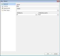
General
Name: Enter a name for the map that is unique within the report. This name is called in code. You can only use underscore (_) as a special character in the Name field. Other special characters such as period (.), space ( ), forward slash (/), back slash (\), exclamation (!), and hyphen (-) are not supported.
Tooltip: Enter the value or expression you want to display when a user hovers the cursor over the map in the viewer at run time.
Antialiasing: Select the smoothing mode to apply to all map control elements. Choose All, None, Text, Graphic, or select the <Expression...> option to open the Expression Editor and create an expression.
Antialiasing quality: Select the quality for antialiasing. Choose High, Normal, SystemDefault, or select the <Expression...> option to open the Expression Editor and create an expression.
Visibility
Initial visibility
- Visible: The map is visible when the report runs.
- Hidden: The map is hidden when the report runs.
- Expression: Use an expression with a Boolean result to decide whether the map is visible. True for hidden, false for visible.
Visibility can be toggled by another report control: Select this check box to display a toggle image next to another report control. This enables the drop-down box below where you can specify the TextBox control that toggles the visibility of the map. The user can click the toggle item to show or hide this map.
Appearance
Border
- Style: Choose from None, Dotted, Dashed, Solid, Double, Groove, Ridge, Inset, WindowInset, or Outset.
- Width: Specify the width of the border.
- Color: Select a Web or custom color for the font.
Background
- Color: Select a color to use for the background of the map.
- Gradient: Specify whether and how to use color gradients in the color scale background. Select from None, LeftRight, TopBottom, Center, DiagonalLeft, DiagonalRight, HorizontalCenter, VerticalCenter, or select the <Expression...> option to open the Expression Editor and create an expression.
- Gradient End Color: Select a color to use for the end color of the background gradient.
- Pattern: Select the hatching pattern of a report control.
Data Output
Element name: Enter a name to be used in the XML output for this map.
Output: Choose Auto, Yes, or No to decide whether to include this map in the XML output. Choosing Auto exports the contents of the map.
Layers
A map is a collection of layers that display data on the map control.

- Polygon layer: Display outlines of areas or markers for the polygon center point. See, Use a Polygon Layer for more information.
- Point layer: Display markers for point locations. See, Use a Point Layer for more information.
- Line layer: Display lines for paths or routes. See, Use a Line Layer for more information.
- Tile layer: Adds a Bing map tiles background. See, Use a Tile Layer for more information.
A map can have one or more layers. You can load these layers on top of each other to create a more detailed map. For example, a polygon layer can represent the borders of a country, a line can represent transportation routes, a point can represent the locations and a tile can add a virtual earth background on the map. See, Use Layers for more information.
Map layer element appearance:
- Properties that you set on a polygon layer, line layer and a point layer apply to all map elements on that layer, whether or not the map elements are embedded in the report definition.
- Properties that you set for rules apply to all map elements on a layer. All data visualization options apply only to map elements that are associated with spatial data.
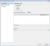
Map Layer Data Dialog
The Map layer Data dialog is used to set up spatial and analytical data for the map control. For more information on spatial and analytical data, see Add Data.
To access Map Layer Data Properties dialog
- Click the map until the map panes appears.
- Right click the layers pane and select Add <layerName> Layer. This adds a new layer to the map and opens the Map Layer Data Properties dialog
Or, in case you already have a layer added to the map control, then follow these steps:
- Click the map until the map panes appears.
- In the layer pane, right-click the existing layer and select Layer Data to open Map Layer Data Properties dialog.
General
Spatial data source: Select one of the spatial data source connection types:
-
Embedded: The map layer data is loaded from the .shp data source that you embed into the map layer by indicating the .shp file in the Import spatial data from file: field. This field appears below when you select this option.
Spatial fields: Use the plus sign button to add a field, and the X button to delete a field. For each newly added spatial field, you must specify the name and type in the corresponding fields below.
Field name: Enter a name of a spatial field.
Field type: Select the type of a spatial field from the list.
- Linked: The map layer data is linked to the .shp file and is uploaded at report rendering. You select this type of data source by indicating the .shp file in the File Name field that appears.
-
Dataset: The map layer data is loaded from the data source of the report. In the Dataset field and in the Field name field that appear below, select a dataset from the bound data source and a dataset field.
Caution: In Field name, simply type the name of the dataset field that contains spatial data. For example, enter the dataset field name as StateName, not as =[StateName].
-
Analytical data: The map layer data is loaded from the the analytical dataset of the bound report data source. In the Field name field that appears below, you must set the name of the data field that contains spatial data in the Analytical dataset.
Caution: In Field name, enter the data field name as =[StateName], not as StateName.
Analytical Data
Dataset: Select the dataset for the analytical data to be displayed on the map layer.
Match: Use the plus sign button to add a relationship between a spatial data field and an analytical data field.
Spatial field: A field with spatial data that specifies an element on the map surface, for example, boundaries of a country.
Analytical field: A field with analytical data that displays information on the related map element, for example, the country population.
Filters
You need to provide three values to add a new filter to the collection: Expression, Operator, and Value.
Expression: Enter the expression to use for evaluating whether data should be included in the map.
Operator: Select from the following operators to decide how to compare the expression to the left with the value to the right:
- Equal Only choose data for which the value on the left is equal to the value on the right.
- Like Only choose data for which the value on the left is similar to the value on the right.
For more information on using the Like operator, see the MSDN Web site. - NotEqual Only choose data for which the value on the left is not equal to the value on the right.
- GreaterThan Only choose data for which the value on the left is greater than the value on the right.
- GreaterThanOrEqual Only choose data for which the value on the left is greater than or equal to the value on the right.
- LessThan Only choose data for which the value on the left is less than the value on the right.
- LessThanOrEqual Only choose data for which the value on the left is less than or equal to the value on the right.
- TopN Only choose items from the value on the left which are the top number specified in the value on the right.
- BottomN Only choose items from the value on the left which are the bottom number specified in the value on the right.
- TopPercent Only choose items from the value on the left which are the top percent specified in the value on the right.
- BottomPercent Only choose items from the value on the left which are the bottom percent specified in the value on the right.
- In Only choose items from the value on the left which are in the array of values specified on the right.
Selecting this operator enables the Values list at the bottom. - Between Only choose items from the value on the left which fall between the pair of values you specify on the right. Selecting this operator enables two Value boxes instead of one.
Value: Enter a value to compare with the expression on the left based on the selected operator. For multiple values used with the Between operator, the lower two value boxes are enabled.
Values: When you choose the In operator, you can enter as many values as you need in this list.
Value: Enter a value to compare with the expression on the left based on the selected operator. For multiple values (used with the In and Between operators) separate values using commas.
See Also